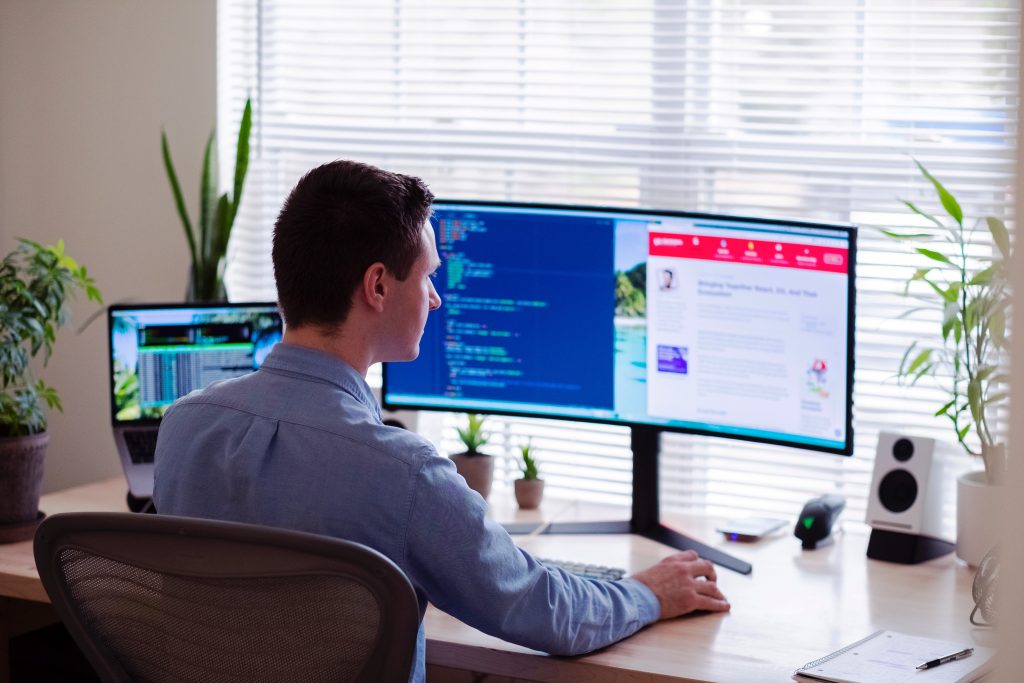
Photo by Luke Peters on Unsplash
The more people working in an industry, the more trends and innovations you’ll see. According to Statista, there are approximately 178,900 web developer jobs in the United States, with a projected 205,050 by 2030. Every month, designers come up with new things to make websites more intuitive and appealing.
You could potentially implement hundreds of new trends on your site, but some make more sense than others. We’ve considered some of the more popular trends, which ones are likely to stay around for a while and chose six we think you should consider implementing.
1. Parallax Elements
Parallax scrolling has been popular for some time now. Certain elements on the page load at a different speed than others, giving emphasis to specific items on the page.
Now, designers are adding in some parallax animation, where illustrations move at different speeds to tell a story to the site visitor.
Marussia utilizes several parallax elements on their website. As you scroll down the page, the images move a bit more slowly than the background and text. However, they also use some parallax animation to drop in words at different speeds, giving emphasis to certain keywords within the subheadings.
2. Good Flow
With more people than ever getting online via their mobile devices, creating a smooth flow to your page is essential. Imagine the user scrolling for information and where elements should appear. You also want to tie sections together in a way that makes sense rather than having random information here and there.
Illuminated Integration has a gorgeous layout on their page. The site offers an industries served section and customer testimonials below. It makes sense to have the two sections close to one another to create a thought process flow for the user.
3. Soft Colors
More people are working from home, searching for jobs online, reading digital articles and spending tons of time on devices. Eye strain is a serious issue for people in all industries. While contrast helps set off text and make elements pop, it can also be harsh to the human eye.
Because of the inordinate amount of time most people spend online these days, soft colors are making a comeback. This is a trend likely to stick around for a long time, because it is so visually pleasing and healthier for the eyes.
Mobile devices also use dark mode so setting your site up with a similar look is another option that creates less harshness for eyes.
4. Neumorphism
Minimalism has been around since at least the early 1900s and has been a popular web design trend for many years. Simple elements, lots of white space and limited color palettes create a professional look.
Neumorphism combines realistic retro looks with minimalist elements. You might see flat design, simple icons and basic color selections. By going back to the roots of design and keeping things simple, it’s then okay to add in a unique photo or video here and there without overwhelming the user.
Laptop Nuts used a neumorphism design for their form to draw user interest and make things seem comfortable and familiar. Note how the button doesn’t have any three-dimensional effects and the color is a solid one. Things are kept simple and to the point. The form and call to action (CTA) button might be from 10 years ago or from today.
5. 3D Colors
Three dimensional colors have been around for a while but they are more vibrant than ever. They work well with other design trends, such as minimalism to add some interest to your hero image or CTAs.
Adding three different hues to your page can draw users in and make them more likely to engage. Think of a hard gradient or colors overlapping to get an idea of how it looks.
Stripe uses three dimensional colors on their landing page, meshing purple, blue, deep pink and orange for a bold diagonal strip of color. The rest of the page is simple, so the differing shades add some interest.
6. Mobile Compatibility
Although people have been working to ensure their sites are mobile responsive for a while, this is a trend not likely to go out of style anytime soon. According to Datareportal, around 92% of internet users go online via mobile devices at least sometimes.
If your site isn’t ready for mobile devices, you may lose some users who have a negative experience on their smartphones. It’s best to prepare for visitors from different screen sizes.
Check Out New Trends
Technology changes at the speed of light. The popular trends of today often shift into something different in a few months. While some trends will remain thanks to the way we interact online, others will fade away into the history of web design only to be viewed via online archives and debated in design circles.
When new trends arrive, look at them through the lens of what might have staying power. Does the trend create a better user experience in some way? Is it likely to work with new technology as smartphones gain capabilities and internet speeds increase? When you look to the future, you’re likely to see which trends work best for your site long-term.
You can find out more about the website design company San Francisco.
Eleanor is the editor-in-chief at Designerly Magazine. She was the director at a marketing agency prior to becoming a freelance web designer. Eleanor lives in Philly with her husband and dog, Bear.
