Because websites are typically the heart of a business’s online marketing operations, user-centric design is a powerful tool to make your digital advertising more effective.
These key considerations will help any site designer build a user-centered website.
1. Keep Design Elements Consistent
From the beginning of the design process, it’s important to prioritize consistency.
Your website effectively teaches visitors how to use it. If the behavior of site elements changes from page to page, going against established expectations, visitors may become confused or frustrated. For example, if a site logo leads to the homepage in one part of the site, it’s generally a good idea to have that same behavior on every page.
The same problems can come if the graphic design of the site changes radically from page to page. Consistent use of color and typography can help to put visitors at ease while building brand and site identity.
2. Consider Diverging Audience Needs
Not every member of your audience will need exactly the same thing. For this reason, it’s not uncommon for landing pages and home pages to segment the audience into different sales funnels right away — offering diverging links that help to manage these needs.
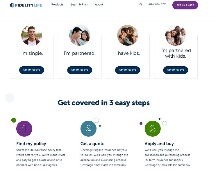
For example, see the homepage from Fidelity Life, an online life insurance company.

This homepage provides a clear path forward for four different types of customers, based on their marriage status and family size.
Because life insurance policy terms can vary depending on whether you’re single, married or have kids, offering different options will help steer them to the correct quote estimate tool, streamlining the overall investigation and buying process.
A menu like this on a homepage is not uncommon for businesses that offer quotes that vary significantly depending on the type of customer — like power companies that serve both individuals and commercial customers.
Keeping in mind instances like these where customers may need unique tools to meet their needs can help you provide value to your entire audience.
3. Make Navigation as Frictionless as Possible
Navigation can have a major impact on user experience. If important business information and resources aren’t easy to find, it could make the entire experience of visiting the website much less enjoyable — possibly encouraging them to leave the site.
Streamlined navigation often depends on having the right header design.

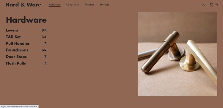
For example, see this page from Hard & Ware, a London-based design company that specializes in manufactured objects.
The navigation header has four list items and a logo. Two of these list items expand when hovered over, revealing a list of product categories.
Each of these list items also shows how many products are in each category with a number. Customers will know which categories have more options, helping them decide which to investigate first.
They also can browse by collection or finish, or look through a collection of previous projects that the brand has worked on.
As with many sites, the logo is a link that leads back to the homepage, allowing visitors to return there from anywhere on the site.
This approach to navigation isn’t complex, but provides users with quick and easy access to essential site pages — in this case, the homepage, a few product catalogs,
4. Present Information Creatively
Visitors coming to a business website are typically in search of some kind of information. They may want to know a business’s hours, learn more about the products the business offers or just what the business does.
Being able to present this information in an easy-to-understand format can help minimize friction a user may experience while browsing your site.
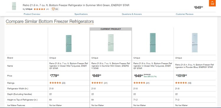
Product information, for example, can be presented in a way that makes complex specs and feature lists that may differ from item to item much easier to compare. Consider this design choice from Home Depot’s website.

This comparison tool appears towards the bottom of individual product pages. It includes specifications for the product the customer is looking at, as well as specs for related products at a similar price point.
Each of the images links out to the respective product page, allowing customers to quickly browse through the alternatives that Home Depot has identified.
If a product is mostly right for a customer — but is missing a key feature or doesn’t have quite the right specs — they can quickly compare it with other recommendations. This feature helps to streamline ecommerce product discovery, making it simpler for customers to pick out the right option from a wide range of choices.
5. Be Ready to Iterate
User-centered design is typically an iterative process. You may not know what all customers need when you first design a website — and sometimes, your solution to customer problems may not work as well in practice as they do in theory.
Effective user-centered website design often looks more like a process than a goal. Creating a user-centered website can sometimes take time, feedback and multiple drafts to truly nail down what your audience needs.
The best way to accelerate this process is to prepare tools that can collect user behavior data and user feedback from the site after it goes live.
Getting into a cycle of gathering research and validating hypotheses about how visitors use your site help you provide the most value possible to your target audience.
Building a User-Centered Business Website
The right design choices can make any website a good fit for your audience.
Keeping visitor needs in mind during the design process will help you create elements, like consistent navigation headers, that make browsing the site as smooth as possible. Planning to gather user feedback and integrate it into site design updates will ensure that you keep your site user-centered after it launches.
