There is nothing like a well brewed cup of coffee from a local coffee shop. Independent coffee shops have my heart. Therefore assisting coffee shop owners in getting their brand to market and their message out there is very close to my heart as well.
The neighborhood coffee shop can bring a community together. It can become a Saturday morning tradition for the family up the street. It can be the birthplace of great ideas and innovation. It can even be a home-away-from-home for the couple just needing a place to connect without all the distractions of life. The neighborhood coffee shop can be so many things to so many people IF they truly establish themselves and make themselves known.
A huge component to establishing any new business must be that when the locals search for a product (coffee) or service (free wifi) you provide, they must find you easily. Another strategy of any new business is ensuring your story is being read, heard and talked about by the people who do land in your shop.
So if you are wondering – how important is the layout and content of your our coffee shop website?
The correct answer would be – “very important!”
And because I love you… I mean… I love quality coffee shops, I want to help you and offer a template for your coffee shop website. You do not have to include every single aspect that I suggest. However, these suggestions will assist you in making sure your website’s message is just as bold as your coffee.

Pages of a Coffee Shop Website
So here are the pages you’ll want to likely include:
- Home Page
- Our Story (About Us)
- Menu
- Coffee & Espresso Offerings
- Bakery/Kitchen Items
- Other
- Shop Now (if you have an online shop)
- Upcomings Events & Opportunities
- Find Us
- Contact Us
Some Other Optional pages might be:
- Space Rental
- E-Gift Cards
- Our Team
Let’s break down these pages. I’ll provide a few suggestions as to what to include on each of these pages.
HOME
Your home page is your “first impression.” Just like with face-to-face first impressions, you will likely have 7 seconds or less (thanks Business Insider) to grab your audience’s attention and make them want to stick around and explore the rest of the site.
Since many people will be looking up your site on a phone, make sure the phone number and address is readily available at the top of the home page.
A Note About Photos For Your Coffee Shop
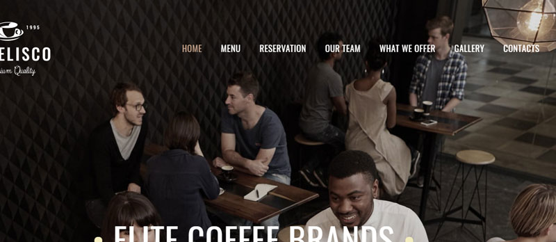
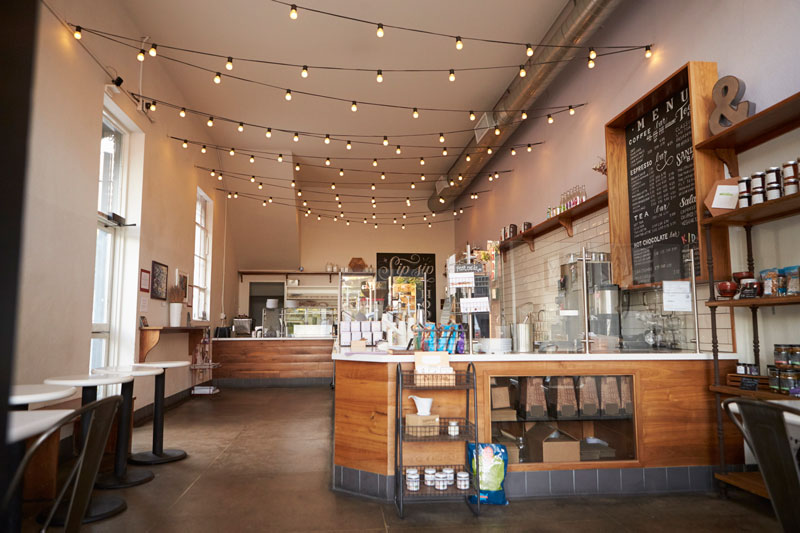
Eye catching images are critical for capturing attention. There is definitely value in getting some professional pictures of your coffee shop taken. I would recommend asking some regular customers or just a handful of good friends to be a part of your photo shoot. Although a picture or two of your empty coffee shop may be able to show off the space, those photos don’t say “Hot Spot”.
A client of mine hired a photographer to take photos of his restaurant before it opened. The photos were great but then he later found himself hiring the photographer to come back because the empty restaurant photos did not create the buzz & community-feel he was hoping for!

In addition to great images, you will want to include your message or mantra. It can be as simple as a heading sharing “Our Mission: ______ “ or “Our Passion: ______ .”
Including your social media links on your home page will bode well for you. Coffee shops thrive off of community and social media can help with that. (If you need some guidance in regards to social media, feel free to check out my most recent series on social media- part 1, 2 & 3.)
On the home page and the contact page why not allow visitors to join your community (via email). A simple statement like “GET EXCLUSIVE UPDATES & DISCOUNTS!” would entice a lot of customers to offer you their email address. And viola, now you have a growing fan base that you can communicate with at will.
ABOUT US (OUR STORY)
Long before websites existed, most business transactions occurred after a face-to-face meeting. The prospective customer would talk with a salesperson (or barista) or business owner to learn about the new business in town and determine if he/she would frequent that business.
Of course, that’s not the case in the age of smart phones. Before a customer ever sets foot into your coffee shop, there’s a good chance their eyes will be on your website.
For that reason, your Our Story/About Us page needs to do more than communicate what’s special about your company’s products or services, it must inspire trust. Because without trust, you’ll rarely get a customer to leave their comfort zone of Starbucks or Dunkin Donuts.
Here are some helpful questions to answer:
- Where did your passion or journey begin?
- What makes your company special?
- What are its core values?
- Is it a private or family-owned business?
- How long have you been in business?
- Who’s at the helm?
- Where are you based?
- Why should someone experience your coffee and cafe versus your competitor?
(Quick Tip: Never knock the competition but explain your uniqueness/superiority to the other options out there)
As you write your Our Story page, put yourself in the readers shoes. Ask yourself who is most likely going to be reading it? Visualize your prospective customers. What about your story is really going to resonate with them?
MENU
Growthink.com offers a Coffee Shop Business Plan and inside they talk about focusing your marketing plan on the four P’s of marketing: Product, Price, Place, Promotion. With your menu page, you can knock of the first two P’s – Product & Price!
When you want to attract a new audience, speak to many of their senses. This is especially true with your menu page. Select a handful of your best sellers and get some high-resolution photos taken. Take time to vividly describe those featured items as well. If you need some inspiration for menu photograph ideas, Pinterest is a great place to start. If you’ve hired someone to build your website for you, be sure to communicate clearly with your web designer as to what you are wanting the layout to look like.
If you or your web designer is utilizing WordPress to build your site, I would highly recommend checking out the Coffee Shop theme offered by TemplateMonster as one option for your website design. You can learn more about the theme in this quick video overview.
The rest of the pages within your website should be mostly self-explanatory. However, I do want to offer a tip for each and warnings on what to avoid.
SHOP NOW (Product Sales Page)
Tip: Let shoppers know what items are your hottest sellers. Share when products are sold out or only available in limited supply. Scarcity creates an increased desire for shoppers to get their hands on the coffee, tea or accessories you are offering.
What to avoid: Fast-moving image carousels! Yes, we can agree that carousels help you show off more products but they can also annoy users. Not to mention that large images in carousels can slow your website down.
UPCOMING EVENTS
Tip: If you are feeling overwhelmed by managing events shared by customers and website visitors, there are WordPress Plugins that can help you manage Community Events like the one from Modern Tribe.
What to avoid: A Blank Page. Wait until you have a handful of upcoming events to share before you publish an events page.
FIND US
Tip: Utilize Google’s My Maps to create a custom map with local landmarks near your coffee shop.
What to avoid: Assuming people know where to park. If your business is located in a high trafficked area, make sure to let first time visitors know where they should park.
CONTACT US
Tip: Take every opportunity possible to acquire email addresses. Do not simply offer your contact information. Allow visitors to provide their Name, Email and a Brief Message and submit that communication directly to you.
What to avoid: Multiple email addresses to contact. Make one simple “info@” for any inquiries and forward any incoming messages to multiple emails if necessary.
In order to actually get this website project done, the last suggestion I would make is to give yourself deadlines and time-block your calendar. If you do not block out time to write out your content and complete your site, you will never just stumble upon time as a business owner.
If you are buried in current tasks and feeling like you can’t take on one more thing, consider outsourcing your website creation. I specialize in helping small business owners launch their first website (or their first professional website). I also have access to freelance writers that can even assist in the content writing process.
A quality website could be the differentiation that your coffee shop needs to establish credibility within your community, so invest some time, resources and energy. You’ll be glad you did.
