3 Hasty Generalizations About Lawyer Websites
Lawyers need websites, just like all other businesses.
I’ve rubbed shoulders with prospects in the legal industry and have a handful of clients who are lawyers in different fields. I’ve observed a few characteristics about lawyer websites that are not always the case, but often true.
- Old Dated Web Design – Many lawyers were early adopters to marketing themselves online and paid a handsome fee many moons ago to get a website created. And now, because they are busy and paid so much for their website in 1999, they leave the dinosaur alone.
- Overpaid, Underdelivered – Let’s face it. We all know lawyers get paid well, or at least have a reputation of being in a high-revenue field. Because of this, they are often targeted by web designers with astronomical fees. Many lawyers will drop $10,000 on a simple website design as long as it does the job because they can recover their cost with 1-2 clients. Many web designers and digital marketing services target lawyers for this reason, but the value delivered falls embarrassingly short of the price paid.
- Verbose – I know I’m generalizing all over the place, but many people may label lawyers and attorneys as verbose. I haven’t necessarily found that to be true of lawyers I’ve met, but I have found it to be true of lawyer websites (and lawyers on TV). I’m not sure exactly why attorney websites are often cluttered and busy, but I do know that as simple design and straightforward content are the trend in web marketing, these overly complex websites should be held in contempt.
…I rest my case. (not really)

A Lawyers Journey To Create a Website
Lawyers: are these 3 things true of your website?
Don’t believe me? Check out this testimonial of a recent client of mine who is a lawyer. He was nice enough to answer 3 question I give to all my clients about how they stumbled onto my service and decided to work with me. His answers were extremely insightful and he agreed to let me share them so others can benefit.
His answers explain the steps that many business owners walk through in getting a website created or redesigned. Whether or not you’re a lawyer, you’ll probably find his input beneficial to your own situation.
His words are in gray boxes below and my comments are in red italics.
Question 1: How did you find my web design service?
A major challenge in creating a website is developing one that speaks to your visitors and potential clients, rather than writing it to be something that you enjoy yourself. Jerome came to this important conclusion and it helped him to envision his own simple website that would speak to his prospective clients in a straightforward way.
And let me take a moment to also recommend Lawyerist.com. I have stumbled onto their website more than once when investigation lawyer websites (and websites in general) and found their content to be excellent in covering almost everything lawyers think about in running their practice like practice management, ethics, lawyer websites and more. Check them out at Lawyerist.com
Question 2: Did you try other web design services before engaging me?
This reinforces my point about lawyers overpaying for sites. $1500 and $100/month isn’t an outrageous price for a website and hosting. But the final product should be high quality at this premium price. As is true in most industries, you don’t always get what you pay for in web design.
Question 3: What ultimately led you to choose my service?
After looking around a bit more, I signed up later in the day and I was off and running. Ryan was very patient and worked hard to get my site up and running. Most importantly, he listened to me and what I wanted. The site he produced was exactly what I was looking for; not what he thought I needed. He made good recommendations for changes and we’ve had a good dialogue to tweak the site to make it even better. Family, friends, and legal colleagues all really like it.
Website builders have become extremely popular in the last several years as technology advances and creating a quality website becomes easier thanks to slick new website builders like Weebly, Wix, and Squarespace that you’re now even seeing in Super Bowl commercials!
CAVEAT EMPTOR (“BUYER BEWARE”) – There are definitely BAD website builders out there, but there are few really great ones. You can see my favorite website builders here, read more about them, and watch my video walkthroughs.
Jerome decided to claim one of my 200 spots for website clients, and I’m glad he did. My service isn’t for everyone, but it’s a perfect fit for many business owners looking to create a simple website that includes ongoing maintenance and marketing guidance from me. If you’re interested, you can get more info here.
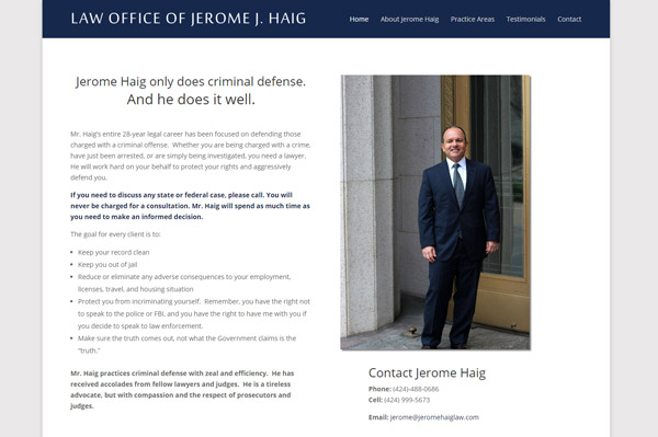
If you’re interested in checking out the final product, you can view Jerome’s website here. If you’re in the Los Angeles area and find yourself in need of a criminal defense attorney, look him up.


