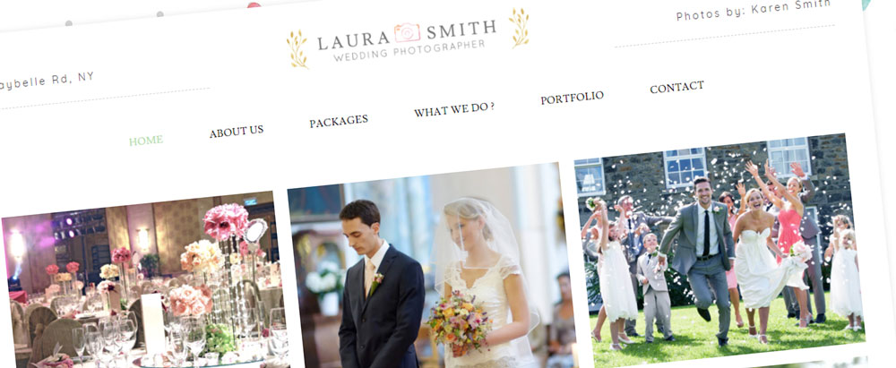
Because a moment can only be captured once, hiring the right photographer is crucial for people hoping to capture images of an event or phase of life. You know that you’re the best photographer around. The million dollar question now is, “Will your clients find you?”
Many potential clients will flip through multiple websites looking for photographers and make their decision based on their first impressions.
If you look at other photographer websites, you’ll see some are making a positive first impression and some are just simply… well, existing.
I want to take a few minutes to run through what key elements are necessary for a stunning, eye-catching website that will separate you from all the other photographers’ websites out there? Here is a list of 8 key components to a successful photography website.
1. Focus On Quality Over Quantity
Successful photographers are highlighting only their best work. When visitors reach your site, you only have a minute (or maybe seconds!) to make a positive first impression. So make the first 5 seconds count! Filling entire pages with countless galleries feels like work to everyone and simply having tons of images won’t impress your audience. Content curation is a skill all business owners really need to master in order to have an elite website that converts. For a photographer, that means you need to let go of your average photos/content, and just stick with your absolute best images.
SIMPLY: Only promote the work you’re most proud of. Don’t fill pages with “average” images.
2. Clear Navigation
Photographers and artists are often too concerned with the visual aspects of the site at the expense of their site being user-friendly. Over half of your visitors are likely “bouncing” from your site (leaving without visiting a 2nd page). According to KissMetrics, poor navigation is a major contributor to increased bounce rates. Your main navigation is the main way people will view more pages on your site. If it’s confusing in any way, you’re only increasing the chance that people will make their exit after a few seconds of being on your site.

It’s imperative that your visitors find it intuitive to navigate the site. Here are some tips to make sure that happens:
- Keep the number of menu items (or tabs) to a minimum (up to 5 or 6 ideally)
- The menu should be placed along the top or at least somewhere that is clearly visible
- Quick contact options should always be present in the main navigation
- Important pages on the site should be accessible in 2 clicks max, preferably 1 click
- Make it easy to access photo galleries or portfolio
- Answer your visitors biggest questions with pages in the main navigation or create a dedicated FAQ page
SIMPLY: Remember everyone is short on time. Can your potential clients find what they are looking for within a single click?
As your site is being designed, seek the feedback of close friends and family. Have them look for a specific item on your site. If they can find it easily (without your guidance) you are in good shape!
3. Slow Down on Your “About” Page
The second most visited page on a website is often your About page, so take some time to craft a quality bio on this page. Photography is an art and your clients want to meet the artist that will be taking their precious photos.
There is a ton of value in including a personal headshot or photo and letting people see you. You could also consider creating a short video with tools like Animoto).
Although it seems simple, the process of writing about yourself can be quite challenging. If an assistant or close friend is willing to write a draft bio for you, it can help you get going in the right direction.
SIMPLY: Clients have to like you, not just your work. Therefore, your About page deserves some significant attention.
4. Only Use High Resolution Images

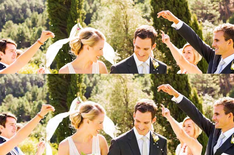
When a potential client goes to your view your portfolio, they expect to see professional images. So give them the pixels! Don’t display images at 300px by 300px! like I see on many photographer sites. Can you see the difference in the two images above. One is 800px displayed at 800px and one is 600px scaled up to 800px and saved at lower quality. This lower quality image will certainly load faster, but it doesn’t do justice to the effort you put in to capture these moments in great shots.
Your website visitors may not even know what image resolution is, but they will definitely know a poor quality image when they see it! The viewer is there to see your work in all its glory, not just a low-quality image optimized for bandwidth.. Want to learn more about how to optimize your photos on your website while maintaining quality? Check out my post here.
SIMPLY: You take time to get great shots and edit them in post-production, so make sure they don’t lose all that added quality on your website.
5. Protect Your Work
With today’s technology, no matter how hard you try to protect your images, somebody, somewhere, can steal a copy. You can disable right click, or put all your images as background images, and hope your users aren’t tech-capable; but that’s not always the best route.
The only way to truly protect your photos is to embed watermarks on them. By embedding watermarks into the images, if someone tries to steal your work, the watermark will always be there. The larger the watermark, the harder it will be to crop it out. I use a tool called FastStone Photo Resizer to edit images in bulk and it also allows you to add a watermark to images.
SIMPLY: Add watermarks to your work before adding them to your website and gallery.
6. Stay Fresh

One benefit of being a photographer is you are creating new visual content as a part of your business. If your website only has photos from 3 years ago, potential clients are may be led to believe you have not been booked up much in the last year.
Styles in photography change as you know. So if you’re showing some posed studio shots from 2002 on your website, you may be losing people who are looking for a more modern style.
And it may not be as simple as keeping things updated every 5 years! What if people are on your website in late November starting to think about family Christmas photos and they see summer shots featured on the homepage of your site? This might not be as powerful as landing on your site and seeing some holiday and winter shots. Stay fresh and current month to month to maximize the chance that your website visitors are seeing the right photos at the ideal time.
SIMPLY: Take the time to refresh your site with new photos. Put reminders in your calendar if necessary so a year doesn’t pass and your website has remained the exact same.
7. Make Sure Your Site is Mobile-friendly
Mobile browsing is growing, and it’s likely that over 50% of your visitors are on a mobile device. Also, mobile-friendliness is now an important ranking factor for Google. Having a mobile friendly site means you are not forcing mobile users to pinch-and-zoom in order to navigate through your site. And that’s where responsive design comes into action. Creating your site’s content to properly adapt to any screen size will create a much better browsing experience.
SIMPLY: Current website builders will allow you to view your site with multiple viewing options, desktop, tablet and mobile. Make sure all three are user friendly.
8. Set Up An Effective Contact Page
As you are likely aware, easy access to your contact information is crucial to your success. Although this is the eighth tip it should, it should certainly not be considered the least important. It may be THE most important tip. Make your contact info as easily accessible as you can. Include it in the main navigation and in the footer of your site if possible.
Make sure there is a general contact forms and shorter forms to contact information from visitors and let them express their interest in your service. Simplify the contact form as much as possible so it doesn’t take 30 minutes to fill out!
SIMPLY: You want the ball in your court. If someone is interested in hiring you or simply learning more, make sure they provide their email and phone number so you can follow up.
Need Help With Your Site?
Many photographers would prefer to focus on the creative end of shooting and editing the photos. Often times, their time is so valuable it makes sense to “pass the baton” and hire professionals to help them with the technical and business end of their company. If that is you and you are looking to hire someone to create your photography website, you may be interested in my website building services. For more information, check out my Complete Website page. If you’re looking to build a site on your own, check out my recommended website builders.
