Restaurant owners are typically good at making delicious food. No one expects them to also be masters at designing websites. And they often aren’t.
But still – independent restaurant owners on tight budgets often take it upon themselves to create their own website using WordPress or some other simple-to-use website builder.

The results of restaurant owners tackling their own website can often leave a bad taste in the mouths of their customers – the people who have to actually use the site to find the menu, directions, and other vital info.
Case in point, check out a few screenshots below from bad restaurant websites. Fortunately (or unfortunately), they were not difficult to find with some quick browsing of one particular area.
Get Your Magnifying Glass
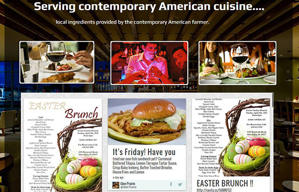
This one has text so small, you’ll need a magnifying glass to see it. Classic mistake…
Not Responsive
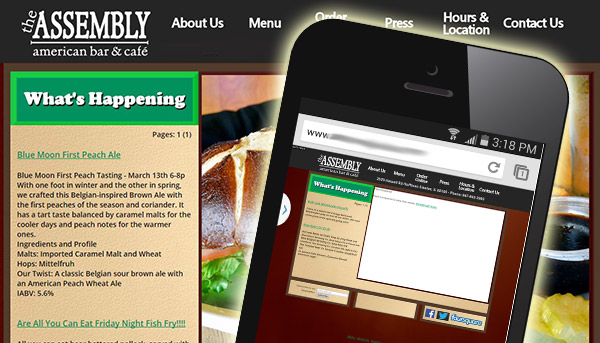
I could tell this site wasn’t responsive when I looked at in on my desktop browser, but it turned out to be worse than I thought. Not only was it a “pinch & zoom” exercise, they also had Flash content that is not supported on most smart phones!
Too Social
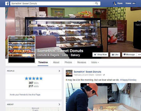
Leveraging popular social networks is a smart move for a restaurant, but relying on them solely and not building your own website could be a risky move. What happens if Facebook closes it’s doors? Not happening anytime soon – I know. But you catch my drift?
Sushi & Balloons!
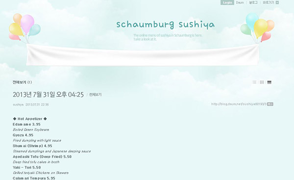
This sushi place is trying to draw the correlation between raw fish and party balloons. I’m not getting it. Although I have had their sushi and it’s OK. The multi-language aspect of the site is a bit confusing as well.
The WordPress Default Theme
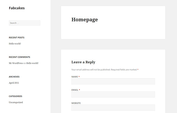
WordPress is super popular so you’ll often find restaurant owners turning their website into a DIY project and going with a default WordPress theme. This Chicago restaurant took default to the next level and they don’t even have any content online, just the default theme content.
Ok, I think you get the point. There are a lot of bad restaurant websites.
You can search on Google or Yelp for local independent restaurants and IF they have a website at all, there’s a high probability that it’s not going to win an award for website design of the year.
So I’ve shown you a few BAD restaurant websites, but what are the ingredients that make a great, or even good restaurant website.
Staple Ingredients for Restaurant Websites
Here are a few ingredients to I recommend after building a few restaurant websites and browsing some bad ones over the years. Add to that a dash of common sense and walah!
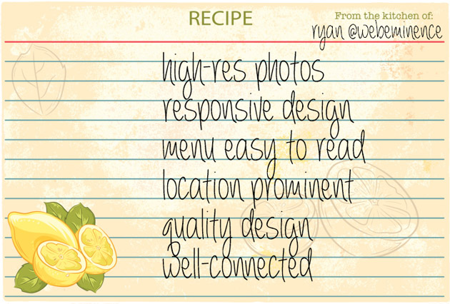
- High Resolution Food Pictures – Restaurants sell food right? So every good restaurant website should have great pictures of the in-house cuisine. Spend $100 and get a professional photographer to shoot some pictures. Trust me – they will be better than the pictures you take with your iPhone.
- Responsive Design – Responsive means your site changes to look proper on smaller screens of tablets and smart phones. Having a mobile friendly site is becoming increasingly important in every industry, but I can’t think of any industry it affects more than the restaurant industry. People are always driving around or even at home doing quick searches on mobile devices to find a place to eat, and statistics show that conversion rates are extremely high for mobile searches related to restaurants. You don’t want your site to be a “pinch and zoom” exercise on small screens like the example site I gave above. You can test your website on Google’s mobile friendly tester.
- Easy to Read Menu – Your menu page should be easy to find and easy to read. It will likely be one of the most frequented pages of your site as visitors check you out for the first time and returning customers think about coming back or ordering take-out.
- Location Prominent – Make sure the location on your website is prominent so people can easily get to your location without too much extra work. Linking to a google map is a nice feature for mobile users who are navigating to your restaurant. Speaking of Google Maps, make sure you have a Google Business Listing so you are better positioned in Google Maps and local search results.
- Quality Design – This goes without saying and is true for every business website, but even more true for businesses in the hospitality space like restaurants. The atmosphere of a restaurant is obviously important and the first impression will often be at the first visit to your website. Creating a consistent feel between the website and the restaurant itself will help your customers feel the vibe you’re shooting for.
- Well Connected – It’s important for any website to be connected on directories and social sites, but it’s even more important for restaurants to have substantial social proof and good reviews on sites like Yelp!. This will help to convince visitors that your restaurant is worth visiting and it also won’t hurt your search engine rankings and traffic.
Website Redesign – One of my Restaurant Clients
The owners of Moncai Vegan in San Diego reached out to me recently. They operate a popular restaurant in the North Park neighborhood of San Diego. Unfortunately, their website was not up to the standards of their restaurant’s unique menu and atmosphere.
They realized this conundrum and that’s why they called me. Their site was actually using a basic WordPress theme, one of the typical problems I described above, so they were in desperate need of an upgrade in design.
They became one of 200 clients of my Complete Website Package and I created this new site for them.
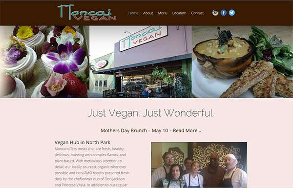
We used a professional design theme by Elegant Themes so the overall project was affordable, but the end result looks like a custom site that cost thousands.
More importantly, the feel of the site matches the look of their restaurant and the website is simple, easy to navigate, and includes all the important features I mentioned above that every restaurant website should have.
My Quick Analysis of RestaurantEngine.com
If you search Google for “restaurant websites”, you’re likely going to come across RestaurantEngine.com, a turnkey website solution for restaurants founded by Brian Casel of CasJam media.
Most web designers don’t recommend other web design services, but I like to take the honest approach, because I know my service is right for a few people, but I also know there are some other solid options out there to get a website online.
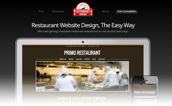
At first glance, RestaurantEngine appears to be a terrific option for restaurant owners for a few reasons:
- They have respectable domain authority and traffic stats for their own website, which tells me they know a thing or two about online marketing
- Their website is modern and appealing in its design
- Price Transparency – Prices are listed on the site and appear to be reasonable (lower startup fee than my service, but higher monthly fee.)
- Hosting and regular maintenance is included
- Restaurant-specific features are available like online ordering, reservation forms, POS, integration with OnlineOrdering.net
- Design themes are used to keep the cost low but overall design of the websites look pretty good still.
One interesting thing to note about RestaurantEngine.com is that the Showcase on their website features logos mainly. The logos look pretty solid, but it appears that they do not actually design logos since their FAQ but logos are provided by the client. This may be a bit misleading for some people – showcasing logos that aren’t actually designed by the company. I’m not sure if they design logos for an extra fee, but that is something I will ask them to comment on.
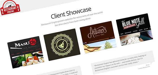
For those of you who have used RestaurantEngine.com, comment below and let us know what your experience has been.
Since I couldn’t find actual completed sites on their website, I pulled a trick and googled “by restaurant engine” to find websites completed by Restaurant Engine since that text phrase shows up in footer of sites they’ve created.
Here are a few I found:
- http://www.fishhouseveracruz.com
- http://www.tequilalopezhouston.com
- http://www.gilbertsonmain.com
- http://www.sushijoa.com
- http://www.cottonexchangewi.com
- http://www.snowandcompany.com
- http://www.solacafe.com
You can search Google to find more but you probably get the idea. You’ll notice some them look similar. That’s because they are using pre-designed themes and some use the same theme. This allows Restaurant Engine to offer the quick service and low price. If you REALLY want a custom web design and don’t want your site to resemble any other site, you may need to find a custom web designer and fork over $2,500+.
For those who want to go the DIY route, you can probably find a similar WordPress theme, purchase website hosting for $5/month, and get a site up and running yourself. But there is some obvious value in having it done by someone else who has done a few restaurant websites already.
Comment Below…
Does your restaurant website currently violate one of the problem areas described above? Do you have questions about setting up a new site or redesigning your existing site? Comment below and I’ll be happy to help.
