For example, when Apple introduced the iPhone in 2007, very few people could predict that it would have such a profound impact on the world of web design. No one really knew that 11 years from that, Google would be rolling out mobile-first indexing prioritizing websites friendly to smartphones over desktop-only ones. Equipped with this amazing product from Apple, millions stopped treating smartphones as a way to merely send SMS messages and make calls. From that point, a smartphone has become a tool for connecting with the world through the Internet.
That’s how the responsive web design was born.
Suddenly, web developers had to design websites more than one screen. With millions of people using the iPhone to browse the Internet, they had to worry about how their websites look on comparably tiny smartphone screens.
Well, this is only one example of how technology managed to change web design and leave some design trends as nostalgia. With technology changing and developing at the speed of light nowadays, the influence on the web is even more profound. In this article, let’s talk about some of the most interesting examples of technology changing the world of web design.
1. Accelerated Mobile Pages (AMP) Have Become a Must
Apparently, with the mobile internet traffic exceeding the desktop, it’s safe to say that the mobile-first mindset is here to stay. The abovementioned Mobile Indexing update to Google’s algorithms means that websites with mobile-friendly designs are prioritized by the search engine, so keeping pace with the change has become a must for online businesses today.
Having a mobile-friendly website design means that it provides an optimal viewing experience on different size screens. Providing that experience is critical for many businesses, as 82 percent of consumers research products on their smartphones before making a purchase.
Google Accelerated Mobile Pages (AMP) is the next step in this direction that is quickly becoming the norm now, and it’s used by many popular app making companies. Simply explained, AMP is an open-source framework created to make mobile web surfing faster, better, and more beautiful by using Google AMP cache and abolishing the unnecessary code and page elements.
Technically speaking, an AMP is an HTML copy that was stripped of unnecessary elements – for example, it limits Javascript and CSS – therefore it loads quicker than standard HTML5. Unlike typical mobile-optimized pages, it is automatically cached by Google AMP cache.
Since loading times are so important for both ranking and visitors, integrating AMP to standardize your mobile responsive pages is something you should do. Google even has an AMP Checker to help with finding out if a web page has been optimized.

Google’s AMP Checker
In case you need help with checking if your website is mobile-friendly, here’s a simple guide for you.
2. Voice Search
This one is actually related to the previous one. With the number of people using voice to search the Internet rising rapidly, optimizing for it has also become a critical consideration for web designers.
“Voice search actually makes a lot of sense,” says Tobias Fisher, a researcher from Pick Writers. “It’s much more convenient and user-friendly than typing, so it’s safe to suggest that it’ll make even more serious changes in the next five years.”
In fact, Forbes says that half of all online searches will be made through voice search by the year 2020. This means that more and more people will choose to search by voice on their smartphones rather than type. Moreover, the number of voice-first devices such as Echo Dot will also continue to increase rapidly.
Already, voice search has influenced the way thousands of websites were made. Specifically, here’s what developers had to consider to ensure that a website is a voice-friendly:
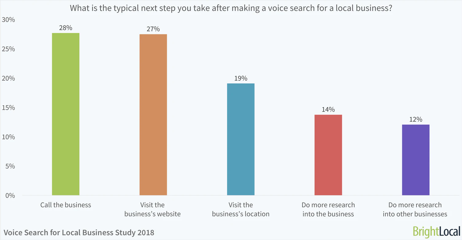
- Page layout should allow the most important content to be on top. It’s a known fact that almost 30 percent of people using voice search tend to call a business immediately after finding them through a search engine.

Image Source: BrightLocal
This means that the most important content on the page should be placed at the top, so designing a website with this mind is important, especially for eCommerce businesses. As a result, website planning and development processes should take this into consideration.
- Optimize your website for mobile. This is exactly what we’ve talked about in the previous section. Since most voice searchers are using mobile devices, having a responsive website is a number one consideration to ensure an optimal experience for them
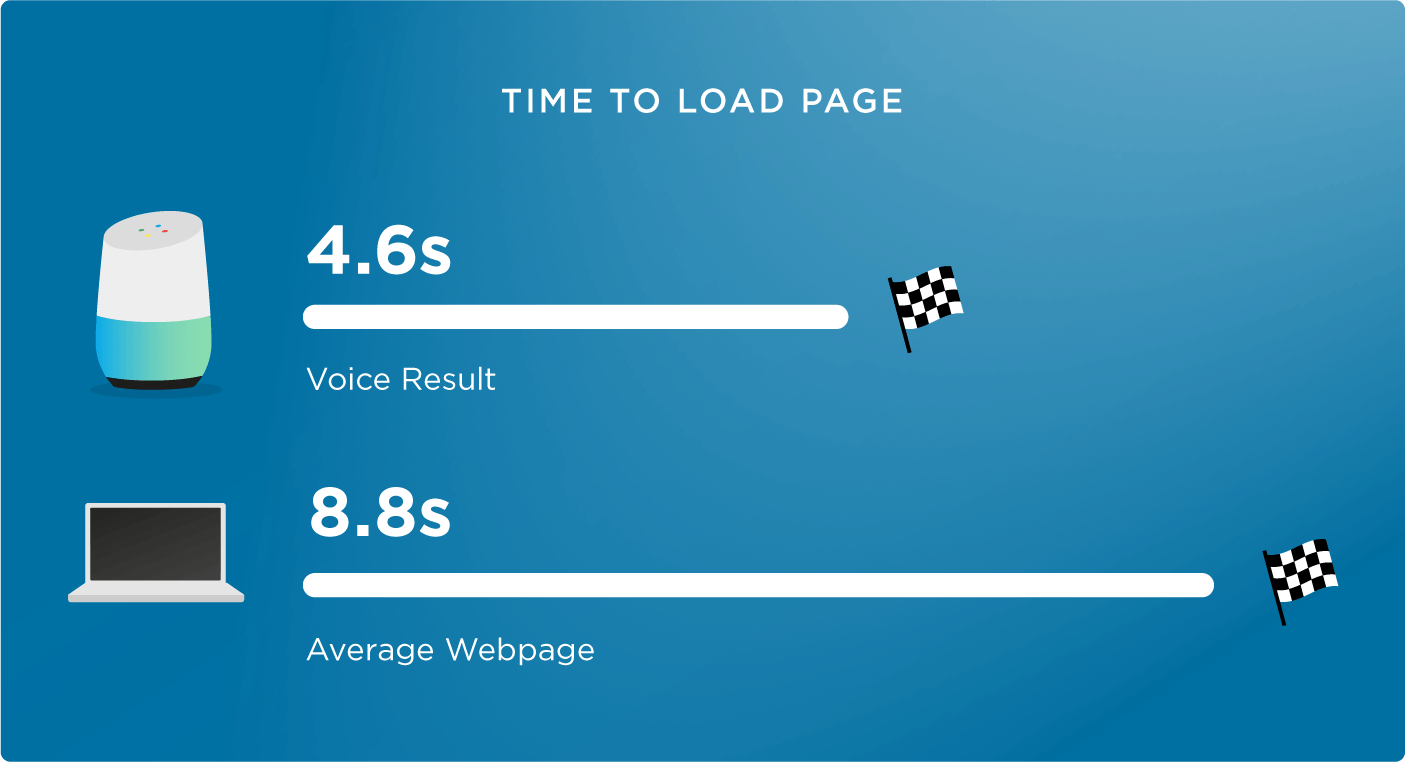
- Make sure that your website’s loading time is minimized. When a person looks for something with a voice, they want to receive an answer as soon as possible. If they aren’t getting this, they’ll move to another website. In fact, a recent study found that the average voice search result page loads in 4.6 seconds, which is about 52 percent faster than the average web page.

Image Source: Backlinko
This is explained by the fact that quickly-loading websites have an advantage when it comes to ranking, as Google considers page speed an important ranking factor for mobile.
3. Trend to Watch For: Progressive Web Apps (PWAs)
This is another technology born out of necessity to meet the needs of mobile Internet users. It’s a very recent trend – in fact, PWAs were announced in 2015 – and promises to deliver something we’ve never seen before: an app-like website that takes advantage of web technology to combine the benefits of native environments and the web.
In other words, the ultimate purpose of a PWA is to make native app-like experience on the web, which is something mobile users can enjoy. Google calls these apps “the future of the mobile web” and one of the main reasons why they are needed is an inability of the responsive design to support progressive enhancements.
Indeed, they make perfect sense: why expect people to have a specific operating system, browser, or smartphone model if we can deliver something that works for everybody?
For example, here’s the list of the most important design features that PWAs that make the difference for users:
- Mobile responsiveness. This is a given.
- Real-time changes and status notifications
- Push notifications that increase user engagement
- Works both offline and online, which solves the problem of a poor internet connection, etc.
- A PWA should make the usage of the web more accessible for people with disabilities.
4. Trend to Watch For: Artificial Intelligence
Yes, “artificial intelligence” is perceived as mostly a buzzword now, but it’s already starting to impact web development. For example, there are AI-powered website builders, UI visual testing tools, and analytics platforms that help developers by giving them insights into how their projects perform over time.
However, it’s still worth noticing that despite some success, all available AI-powered tools are still exploring what the technology can do for web design. That may be the reason why we don’t see a lot of websites made with AI these days. Though, we are now increasingly witnessing a lot of websites using ai text to speech to convert their blog posts to audio blogs and make their content available to a large audience.
Conclusion
Although we’ve come a long way since the iPhone delivered a major disruption to web development, smartphones still remain a major force driving the changes in the industry. On top of that, we have artificial intelligence on the verge of becoming another driver of change, but it’s possible that we’ll have to wait until it becomes a widely used tool in a web developer’s arsenal.
