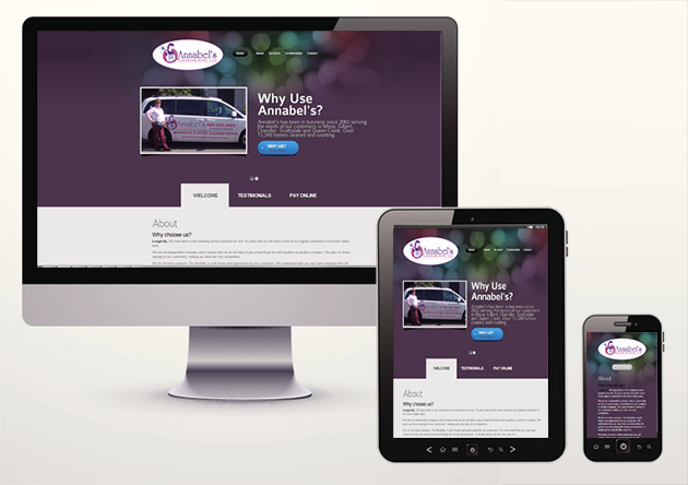
Watch the animation below to see a responsive website in action…

Here are a few elements of responsive design that you see in the animation:
- The entire page width adjusts smaller when certain width values are hit
- The text in the slider area disappears
- Navigation menu becomes a single button
- Slider picture disappears at the narrowest width. Only text is displayed.
What Is Responsive Design?
So what exactly does “responsive” mean? Responsive web design (RWD) is an approach in web design aimed at ensuring an optimal viewing experience on different size screens. The term was not even coined until 2010 but it has become increasingly popular with the explosion of the use of smaller screens on smart phones and tablets.
In the past, websites have been designed for computer monitors 12” to 20” on average, but now people are viewing websites on their smart phone screens as small as 4”. So the goal of responsive web design is to ensure that the website is usable on every size screen. Before we see how it’s done, let’s first understand why it’s important.
Importance of Responsive Design
Some people may argue that responsive design is not important, because as of 2013 less than 4% of visitors on average are using a browser on a mobile device. The thing is – this number is growing steadily and grew by 1.0% in 2012-2013. You can see Mobile Device Statistics here. I think we can all agree that smart phone and tablet usage is on the rise and probably not slowing down any time soon.
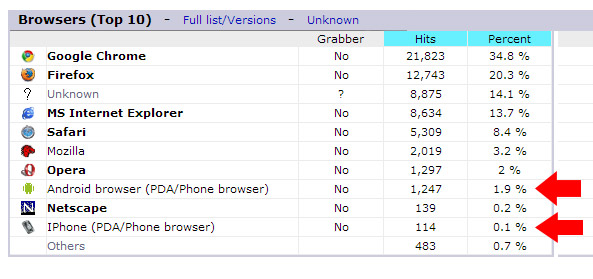
Check Your Stats
The image below shows my web traffic statistics and as you can see from the lines indicated by the arrows, the total traffic coming from Android and iPhone browsers is less than 3.0% for my site in a recent month. So making sure I have a mobile friendly website may not seem critical but it will likely become more and more important as the number of visitors with smaller screens continues to increase. I’ll be watching these statistics closely over the next few years.
You can read this post on how to access your AW Stats to see how many of your visitors are on mobile browsers.
How Responsive Sites Work?
If you’re building your own website, it’s important to know a little bit about how responsive websites work. There are several methods to make a website responsive but here are a few of the main strategies in a nutshell. If you don’t care about the technical stuff, just skip down to my two suggestions below to make your website mobile friendly.
Fluid Grid Concept
This design concept uses percentages for the widths of elements rather than fixed pixel widths. As the screen is resized, the element is always the same % width of the screen. This works great for different computer monitor resolutions but doesn’t always work for smaller screens like cell phones and tablets. Th reason for this is that if you have an element set to use 25% of the width of the screen and the page is opened on a smart phone in vertical view, 25% will be VERY small. Probably too small to fit anything. Usually, better methods are needed to make a website responsive.
Media Queries
Media queries allow a web design to adapt to different size screens by applying different CSS rules to different widths. Look at the code below for example that would be placed in a CSS style sheet:
@media (max-width: 600px) {

.image {display: none;}

}
The first line tells the browser to apply the CSS rule only when the screen resolution is 600 px or below. When it is below 600px, the .image class will not be displayed in this case. This would be a way to remove certain images when there is no room for them and make sure there is room for other important page elements like text.
This is just one simple example but web developers combine many media queries and CSS rules to style a website so it is optimized for all possible screen sizes.
Common uses for media queries are deleting and resizing elements, resizing text, and reformatting the main navigation.
Two Suggestions for Making Your Website Mobile Friendly
1. Use a pre-designed theme that is responsive – Many people use WordPress for their website so one way to ensure that your site is mobile friendly is to make sure the WordPress theme you are using is responsive. Responsive WordPress themes come with all the CSS styles built in to look great on any size screen. This is much cheaper and less time consuming than styling a responsive site from scratch. I use themes from Elegant Themes and many of their themes are responsive.
If you’re using a website builder or other service to build your site, make sure to find one that has designs that are mobile friendly or responsive. Some website builders give you dedicated mobile sites. Read 2 below to understand what a dedicated mobile site is.
2. Get a dedicated mobile site with DudaMobile – Some websites use dedicated mobile sites rather than a responsive site. The difference is – with a dedicated site, a visitor on a smart phone is redirected to another page on your server (e.g. http://m.webeminence.com) that is specifically created for mobile size screens. With a responsive site, the visitor stays on the same page on your site but it is styled to fit the screen size.
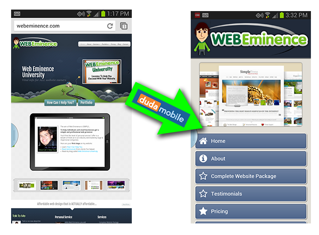
DudaMobile is a popular service that will create a dedicated mobile design for your website free. Head over to DudaMobile.com and type in your URL. The DudaMobile machine will create a mobile site for you in seconds. You’ll then have to follow the steps to link the mobile site to your website.
You can see the mobile site that DudaMobile created for my site above. The classic view of my site has elements that are too small to view without a lot of pinching and zooming. The new mobile site uses large images, buttons, and text so that visitors on mobile phones can quickly find what they are looking for. You’ll be surprised how nice it looks right out of the box but you’ll also be able to completely customize your mobile site.
DudaMobile has a limited free service with ads but there is an affordable option for under $10/month with a ton of upgraded features. Read my DudaMoblie post complete with a video walkthrough to show you exactly how it works.