If you’re a photographer looking for a platform to display your work in a way that is easily discovered and explored, you could turn to WordPress or popular site builders like Squarespace or Weebly. But you should know, there are also all-in-one solutions that exist specially for creatives just like you.
With that in mind, let’s take a look at one of the most popular web applications for photographers and see if Pixpa is right for you.
Getting Started with Pixpa
I got underway with Pixpa through a free trial account which gives you access to the full-featured web app for 15 days. Getting started was really simple, and it was quickly apparent that the site was going to be responsive and easy to use.
Once you’ve created your account, you’ll find a few main navigation options. I’ll walk through these one at a time.
Website
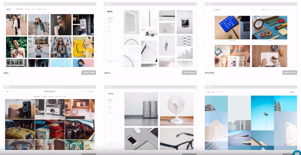
This tab is where you will be spending the bulk of your time as it encompasses the entirety of content management for your public-facing site. Pixpa offers a number of site themes, the majority of which are clean and modern and all of which emphasize imagery.
It works using drag and drop, so if you have any experience with other website builders, you’ll catch on quickly. You can customize just about everything from fonts to colors to layout and also have access to the code in case you have a bit of programming experience. I will say, though, that while the user interface is simple to use, it is somewhat limited.
Adding pages is easy enough, and you have options if you’d like to include a blog, calendar page, ecommerce store, social media feed, or other options. But if you’re a photographer, what you’re really concerned with is how Pixpa displays your images. You’ll be happy to know that the platform has a lot to offer.

You can build multiple galleries which can include both still images or videos. You can add captions to these images, and each gallery or portfolio can come attached with detailed description and client information.
Swapping images within these galleries and uploading new images was as simple as you’d hope from an image-focused platform, but one thing I did find lacking (and a common criticism for Pixpa) is that it doesn’t offer many tools when it comes to editing your images.
Store
Pixpa gives you the option of setting up a basic ecommerce store. This store has some useful built-in statistics about what is being bought and by whom. Plus, your store is also fully customizable. You can change not only the look but shipping options and integrate payments with PayPal and Stripe.
Within the store you can set prices for both prints and digital downloads. To streamline this process you can enable integrations through WHCC, which can place orders, print, and ship – basically complete order fulfillment.
Photo Proofing
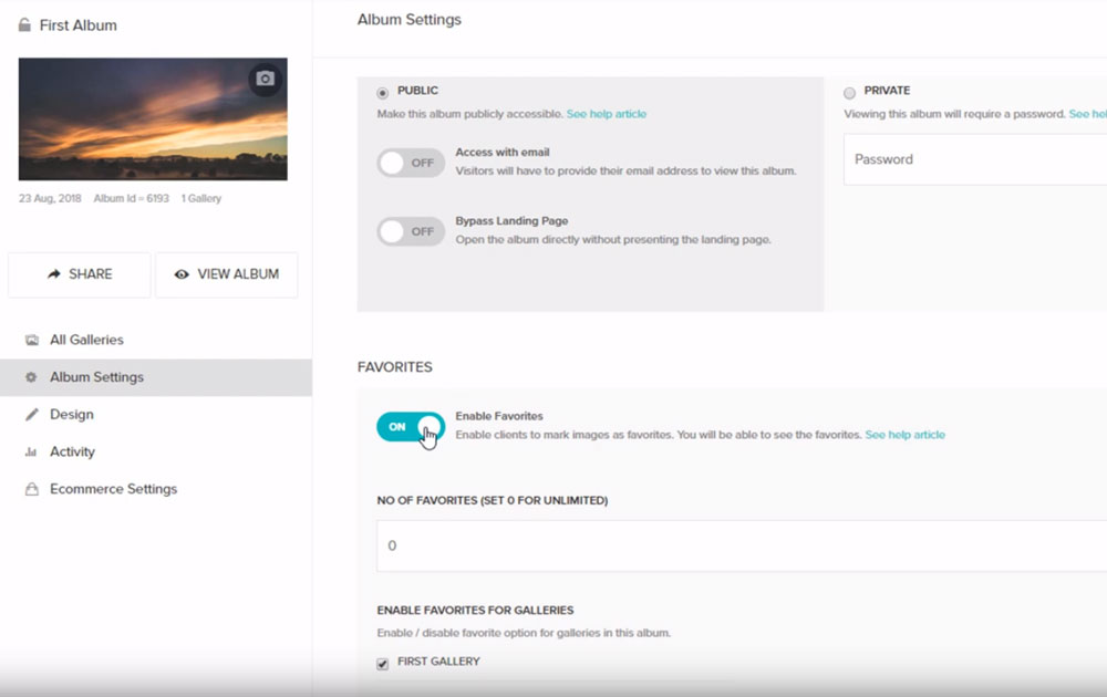
Beyond just showing off your best work, photographers also need a place for clients to review the shots they’ve taken. With this tab you can create albums for clients that allow them to click through your images and ‘favorite’ them. You can also customize the layout, add event dates, and change privacy options (like password protection). You can also enable or disable the ability for clients to download photos and create a SHARE link to provide quick access to anyone you choose.
Pixpa offers 1GB of space for image storage, but you can buy more space as you need it.

Design
This is the style editor for your entire website. You can change spacing, colors, fonts, etc., throughout the entire site. You can also add custom logos and preview the live site.
Overall Thoughts on Pixpa
Ultimately, I’ve found Pixpa to be easy to navigate, image-focused, professional-quality, and stocked with options and integrations. Beyond some limited functionality and lack of an image editor, if you’re a creative looking for a more image-based portfolio site, you might consider the 15 day trial. After that, plans start at around $5 a month and go up to $15 a month so you’ll likely be able to find a price point that works for you.
