I have reviewed a lot of US-based website builders: I think it’s finally time to look at what Europe has to offer with the 1&1 website builder.
Getting Started with 1&1 – Online Business Card
I’ll be digging into the 1&1 MyWebsite Plus package. The first thing you’ll notice when logging in is that they offer a temporary landing page called an Online Business Card. It’s really simple to set up and is great for people who plan to take a long time to build your site. This way you’ll be able to leave visitors a “site under construction” message and more information about your business instead of just a blank page.
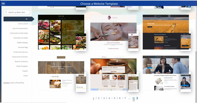
After answering a few preliminary questions about the nature of your business, you’re provided with several website templates. 1&1 has over 300 templates divided into different categories, all of which can be tailored to your business. Each template shows you what the site looks like across multiple devices and even provides some free stock images.

The 1&1 Website Builder Workspace
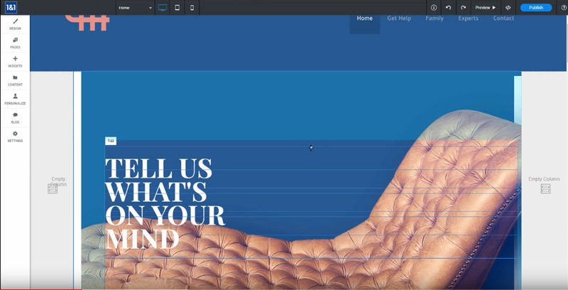
One thing I really like about the 1&1 interface is the large workspace. It really helps make sure no detail is overlooked.
Something else that 1&1 offers that you don’t see with all website builders is full access to the HTML and CSS code, which allows for even deeper customization.
The workspace itself is set up on a grid so text and images can be snapped into place along columns and rows. This functions more like Weebly as opposed to a builder like Wix which gives you full free flow placement to drop anywhere you want on the page.

Making changes isn’t entirely intuitive, which is the first stumble I encountered when getting started with 1&1. I found myself having to do a bit of digging to figure out how to change the background image. I will say, however, that after spending a bit of time learning the layout, you’ll find that changing background images and doing similar tasks comes with a lot of customization options. You can get a better idea of this in my video above.
Unique Features for 1&1
There are a few unique features I noticed when building pages with 1&1 that I don’t often see with other builders. 1&1 gives you the option to add pop-ups to certain pages. So, if you want to promote a newsletter or play a particular video when a page is opened, you have that ability. I would advise against overusing pop-ups, though, as they can cause usability issues and generally annoy visitors. Remember the golden rule and think about how do you feel when you see a popup on a website you’re browsing!
Another nice feature is a Find and Replace option. This comes in handy if you need to change something like an address or phone number across your entire site. I use this feature as a plugin all the time on WordPress sites.
Personalize Feature
The standout feature that suprised me most with 1&1 is their Personalize tab. It’s here that you can customize the site experience for different visitors. If you want to run a special promotion for a limited time, offer a special promotion for first-time visitors, or run a promo for a Holiday, this tab allows you to tailor content to each visitor.
You can also do things like offer location-based coupons if a user visits your site while near a particular location. Or if you run a restaurant, you can tailor your menu to the time of day. Meaning if a visitor looks at the site at lunch vs. dinner time, they get a different experience.
You can find these same features in WordPress, but you’ll likely need a plug-in and the process will be a bit more complicated.
Backing Up the Site
In a recent blog post, I discussed the importance of website back-ups. Fortunately, a feature of the 1&1 builder is a built-in back-up system and the ability to download and restore back-ups. This is a nice feature not included in all website builders and should give you some peace of mind that your site will not be lost entirely.
Final Thoughts on the 1&1 Website Builder
Ultimately, 1&1 is a solid website builder that offers all the features you need to create a slick website (and even a little more). The biggest downside is that it’s not super intuitive, so there is a bit of a learning curve in order to fully maximize the potential of the builder.
It’s also reasonably priced, matching up to other popular builders like Weebly and Wix. The pricing may change, but for Plus packages, which I was using, you’ll spend $9.99 per month for the first year and then $19.99 per month after that. There are cheaper options but those don’t come with all the features we’ve discussed. To see current pricing visit their site.
What do you think of 1&1? Do you have specific questions about it? Comment below and let me know!
