
No matter how useful its features, how competitive your prices, or how amazing your customer service, there’s always likely to be a competitor with a viable, attractive alternative.
And if there isn’t, it’s generally a good idea to assume that there soon will be.
Competition isn’t something to fear, though. It’s something to embrace. It shows that there’s a market for our products while also motivating us to constantly improve our software, support service, and marketing methods.
In this article, we’ll take a look at an important aspect of the latter. We’ll discuss three actionable tactics you can use to ensure your SaaS company’s home page does what it’s meant to do: turn visitors into leads and leads into customers.
1. Lead with a Clear Value Proposition
The very first thing your home page needs to communicate to a visitor is your value proposition. This is a clear statement of the tangible benefits they’ll enjoy after becoming a customer.
Many SaaS companies make the mistake of thinking that “value proposition” means “innovative product features.”
It doesn’t.
Product features are the tools that your customers use to realize a specific set of rewards. These rewards are what your home page needs to sell. And the selling has to happen instantly.
Value propositions should be positioned above the scroll-line. They should consist of as few words as possible, and there should be no visual clutter hurting their visibility.
Let’s take a look at some examples.
Mozart Data has a value proposition that consists of ten words. Even if a visitor is just skimming the page, they instantly know what the company offers and what it means to customers: lighting fast data aggregation.
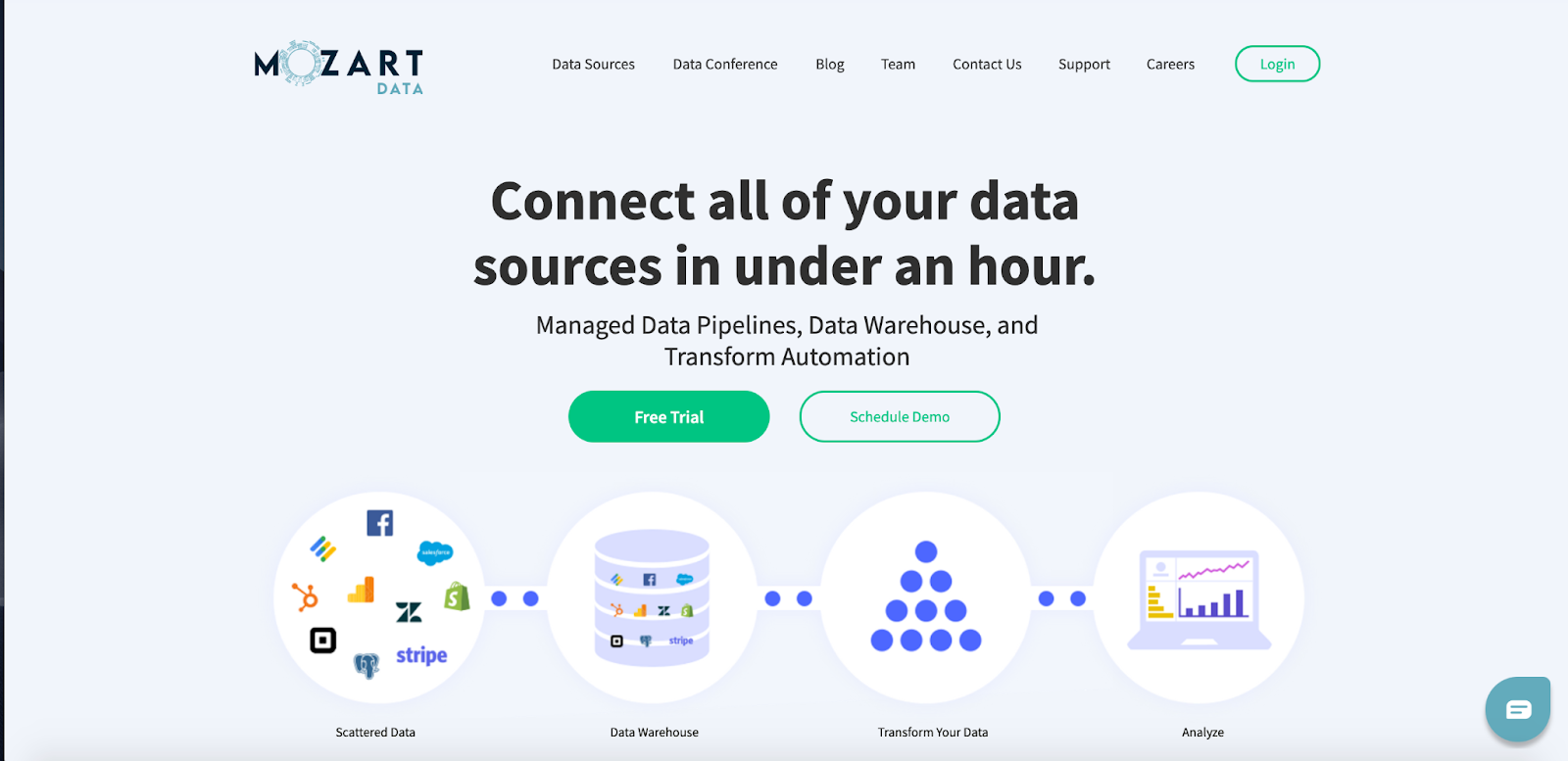
image: mozartdata.com
To further help with clarity, the site designers also placed the text against a solid background color. Additionally, they opted not to use any visual elements that may fight for the visitor’s attention.
Dialog’s value proposition may not be as concise, but the product’s impressive range of benefits justifies the extra verbiage.
The health platform’s header image also manages to be visually striking and highly emotive without overshadowing the copy.
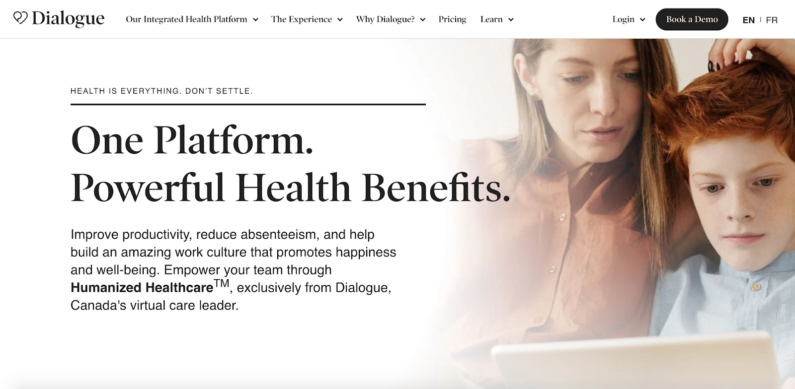
image: dialogue.co
2. Add Simple, Visible Calls to Action
Conversion isn’t always high on the list of a SaaS home page’s priorities. Most home pages tend to focus on communication and lead nurturing rather than making a hard sales pitch. And for a good reason.
On your site’s home page, it’s often more important to keep first-time visitors engaged with informative content than it is to take a shot at an early conversion.
That’s why it’s so rare to see price points and subscription options discussed on a SaaS website’s home page.
This doesn’t mean that you should forget entirely about conversion on your home page. That’s especially if the conversion you’re promoting isn’t a sale but rather the first step towards a sale.
ShowMojo offers us a terrific example of this tactic. Above the scroll-line, right below the value proposition, there’s a large, solitary button labeled “Schedule a Demo.”

image: showmojo.com
The page says literally nothing else about product demonstration. There’s no need to. Simply from the button’s text, it’s abundantly clear what’s going to happen when the user clicks on it.
Amazon repricer, Aura, offers a similarly uncomplicated CTA in their home page header with a button labeled “Free Trial.”

image: goaura.com
This button takes up a fraction of the page’s real estate but carries a ton of meaning. It’s effectively telling visitors: “Click here to skip past all the marketing talk and get straight into assessing our product.”
Both ShowMojo and Aura are examples of sites that cater to visitors who don’t need “nurturing” in the traditional sense of the term.
These visitors often prefer interacting with a salesperson or checking out a trial version over trawling through several pages of marketing content. You can always check out the following if you would like to know more about top SaaS content marketing.
3. Show Your Product in Action
Words can only go so far when explaining to visitors what your SaaS product is all about.
Hopefully, your copywriter is skilled at breaking complicated concepts down into accessible chunks of information. Unfortunately still, many visitors simply won’t be sufficiently invested to read through all of it.
This is the reason why many SaaS companies illustrate product features using animated demo visuals. It’s the best way to prevent visitors from tuning out before fully understanding how their software can revolutionize their lives.
Pandadoc uses a beautifully engaging embedded animation sequence in their home page header to illustrate the entire workflow that their flagship product enables.
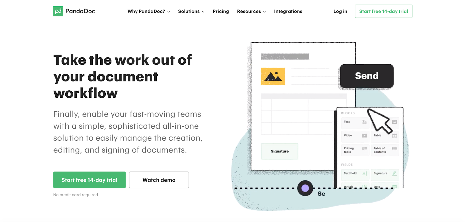
image: pandadocs.com
The sequence is fast-paced and wastes no time on non-essential features. There’s also a clever breadcrumb-style timeline at the bottom of the video showing the user which part of the process is being illustrated.
This animated sequence would have been far more expensive to produce than a written explanation of the product’s core features. However, this investment is justified when you consider how effective it is at keeping visitors engaged.
Wufoo takes a slightly similar approach with the excellent, 80-second explainer video embedded in their home page. Explainer videos are an exceptionally powerful way to keep visitors’ eyes on your site and reduce the amount of time needed for them to fully grasp the value your product offers.
In Closing
Before making wholesale changes to your SaaS website’s home page, bear in mind the importance of analytics.
You don’t want to implement new copy, visuals, or CTA elements without having a thorough understanding of your current home page’s most important performance metrics:
- What’s the average length of time a user spends on your home page?
- What are the click-through rates to every other page on your website?
- What’s your home page’s bounce rate?
It’s essential that you have the option to roll back on changes if your new, improved home page performs worse than its predecessor. And it’s equally important to know exactly where your new page is underperforming.
To that end, it’s vital that you install Google Analytics, learn how to analyze usage data, and give your site enough time to build meaningful knowledge before implementing UI changes.
You may also choose to introduce changes incrementally. This allows you to spot how each new element affects user interaction individually.