Let’s address the latter first. Maybe in the past you have found yourself asking, “Do I really need a website?” Well, I would encourage you to consider this: Even if a potential client hears about you through word of mouth, that individual is likely to look you up online before scheduling an appointment through a WordPress booking system or a service scheduler software. Today not having a website can create a bad first impression. It can leave your potential clients asking themselves, “How reputable is this practice if they don’t have a website?”
Don’t fret though, creating a website does not have to take you away from your current practice and clients. Understanding what information needs to be included on your website is the most challenging aspect. That’s where I come in. I have helped counseling practices develop a strategy and the content for their website and in the next few minutes, I will help you as well.
If you are in the boat of “I need to update my website,” you’ve come to the right place. I will provide you with a handful of key components that will allow you to take your website from a paddle boat to a speed boat when it comes to reaching your target audience.
Step 1 – Strategy With Clients & Patients in Mind
Pinpoint The Problems That You Help Your Clients Solve
You’ve only got a few precious seconds to connect with your website visitors and let them know that your therapy services can help them with the issues they’re facing.
With a notepad or a blank Word Doc in front of you, take some time to think about your potential and existing clients and their state of mind as they’re searching for a therapist they can trust with their problem. Then write the content for your website from that place.
A website, specifically the landing/home page, should explain 1) who you help and 2) what you help them achieve. Your landing page needs to be like an elevator pitch in order to quickly let the visitor know if they are in the right place. Most visitors are on a website less than 59 seconds!
Another great strategy is to include questions to connect with your visitors and let them know you can relate to the pain or challenge they find themselves in.

Here are a few examples:
- Is pain from your past or worries about the future making it hard to enjoy the present?
- Do you find yourself on the brink of divorce, wondering if there’s any hope at turning your relationship around?
- Do you struggle to find the passion and joy in your life?
KEY QUESTION: what do you help your clients achieve?
Once you have the answer, make that answer extremely clear on your therapy website’s homepage.
Step 2 – Content Organization
A question that I most often get from clients is, “What pages should my website have?”
For a counseling website, I would encourage you to consider building out the following pages:
- Home – Landing Page
- About Me/Us – Counselor(s) information Page
- Services
- Resources
- FAQs
- Location + Contact
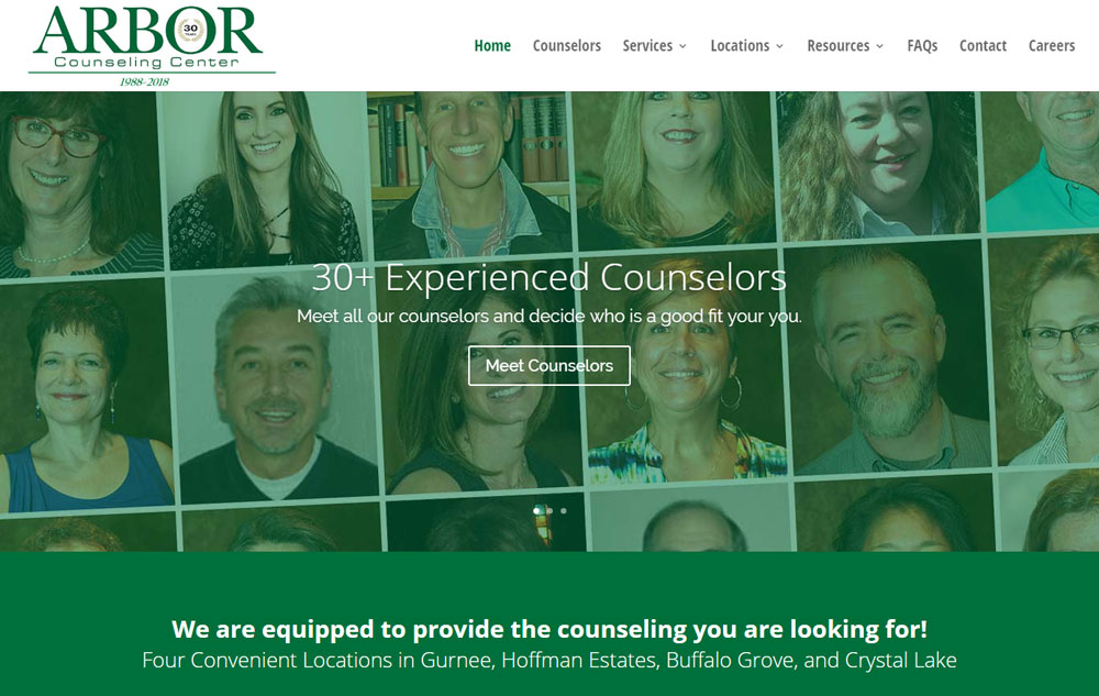
If you are looking for a template, you may want to check out ArborCounselingCenter.com as they recently updated their website and can offer some great insight as to what can and should be included.
The three most important pages are going to be your Home, About, and Contact Page. So let’s take a couple minutes to discuss what is required to make those pages as effective as possible on your website.
A Home Page That Captures Your Audience
No doubt about it, your homepage is one the first impressions your future clients will have of you and your private practice. With just mere seconds to grab the attention of a website visitor, it’s important to know what to put on your private practice website’s homepage.
A Headline That Captures The Attention of Your Potential Clients
You only have a few seconds to let your website visitors know they’re in the right place.
Create a clear and simple headline that speaks to your potential clients and let’s them know where you are and who you serve in your practice and the outcome you help them achieve. This is your quick chance to convey the benefits of working with you, so think about your ideal client and what they want to achieve and write your headline from that place.
For the Arbor Counseling page, it was important to communicate the large number of counselors available at 4 locations in the Chicago area. We accomplished this with a picture and a few large text headings that appear first on the home page.
Creating an Attractive “Our Counselors” or “About Me” Page
The “Our Counselors” or, in the case of a solo-practice, the “About Me” page is often one of the highest trafficked pages on a counseling website. Prospective clients are attracted to these pages as they typically include headshots and bios of the practice’s clinicians. Counseling is a very personal matter and prospective clients will want to know the individual they will be sitting with and feel very comfortable with them. Make sure this page is easy to find, and accessible from every other page on the website.
Consider Including A Professional, High-Quality Photo Of The Therapist(s)
If you don’t have a good photo, consider hiring a professional photographer. If a professional photo brings in a single new long-term client, your professional photographer will easily pay for themselves. For more information about including a photo on your website, check out this comprehensive blog post on personal photos.
On Your Contact Page, Consider Including These Two Things
Pictures and a Map to the Office
I would recommend including an image of the outside of your building. This can help clients find your office when arriving for a first session. First time clients are nervous enough. You don’t want them concerned if they are entering the right place. Also, include interior pictures. If they are well done, will show clients the care you’ve spent outfitting a clean, comfortable space.
People should already know WHERE you are from your home page headline but the contact page should have a map marker and address. By the time they see your contact page, they will know your address, exactly where you are on a map, and what the building looks like!
A Contact Form
This one should be a no-brainer. Your clients want to contact you and they may not want to pick up the phone just yet, so make it easy for them with a built-in contact form. I always tell my clients, “You want to keep the ball in your court.” You want to be able to follow up with them, and NOT wait for them to someday contact you.
You may be thinking, “I already have my email address –isn’t that enough?” Unfortunately, the answer is no. An email address is inconvenient for clients, because they need to open a separate email program to contact you.
So add a contact form, and make it easy to find. Don’t make clients search for a way to contact you. Put your contact page right in your menu, and label it something obvious like “Contact” or “Book a session.”
Once your content is complete, you’ll want to take some time to make sure that your overall website is user-friendly.
Here are FOUR key components to ensuring that your visitors have a good experience accessing the information and ultimately your services.
1. Clear Navigation
There’s nothing more frustrating to me than landing on a website and not being able to find the information I’m looking for.
One way that you can minimize the frustrations of your website visitors and make the important stuff shine is to be really concise and clear with our navigation menus.
Do your best to create a clear structure for your navigation menus putting only the essential pages in the main navigation with secondary pages nested underneath in a parent menu structure.
You can think about it like a well-organized set of folders on your computer. In order to drill down to specific info, it helps to have a few set of top tier folders, with relevant information within those folders. This is especially important for your Resources page where there might be a lot of links in different categories.
It’s acceptable to have a few parent links (maybe 4-5) within your content that leads folks to relevant information on your website, but try not go overboard so that it becomes a distraction and people don’t know where to click. External links to other websites are useful too, but I would recommend against a ton of links that lead visitors away from your site.
2. Be Sure To Include Address and Phone Number on Each Page
You do not want to make your website visitors go on a scavenger hunt to find your practice’s address or phone number. Make sure the information is visible on every page. Often the footer (bottom) is a common location that works well. A phone number in the header (top) of each page is also a convenient location.
3. A Mobile Friendly Design
For years now, mobile internet usage has exceeded PC internet usage. In other words, majority of your potential clients will visit you on their mobile phones. You can’t afford to ignore this information.
So make sure your website is mobile friendly. The most important step here is to make sure that your website uses what’s called a “responsive” design, which ensures that your web pages will resize themselves automatically to fit a smaller mobile screen. Check out my post – Is my website mobile responsive?
The easiest option is to test using Google’s mobile friendly tool. You also may want to test your site on your own mobile phone. Even if Google’s tool gives it a passing rating, there is no substitute for seeing it for yourself. Browse through the website on your phone after viewing it on your computer and see if you can find any formatting errors or any areas that are difficult to navigte.
If Google’s tool gives your site a failing grade, or if your website doesn’t look pleasing to the eye on your phone, it may be time to give your website a facelift (or invest in a new website.) While a new website can be an investment, losing customers due to an outdated website is likely more expensive. I will give you a few recommendations as to how to update or rebuild your website at the end of this post.
4. A Prominent Call to Action
The final element for a successful counseling website is a clear call to action. You want to frame the next step that your potential clients should take when they get to the end of your content.
Try to choose just one action you want them to take and make it prominent. Do you have a free phone consultation you can offer? Or do you want them to simply fill out the contact form and start a conversation about counseling?
Think about what your visitor needs to do in order to become a client after looking at your homepage, then make it simple for them to take the next step.
The last question you may be asking is, “how do I get this website built?”
SquareSpace, Wix, and Weebly are just three of the multitude of platforms on which one can build a DIY website. These platforms require zero knowledge of “coding” and are extremely affordable starting at just a few dollars a month.
However, the upfront time investment and long-term maintenance may be enough reason to hire someone to build and manage your website. After all, your time is your most valuable asset especially in the counseling realm. If you find yourself wanting to outsource the creation and management process, I would highly recommend looking into our affordable website package. We have built over 300 websites in the last 7 years and completed dozens of website re-designs. He and his team expertise to give your counseling practice the website it needs.
Counseling & Therapist Website Examples That Apply 5 Essential Elements
Now that I’ve provided a step-by-step process to building a successful counseling website, let’s dive deeper with five essential elements to help your site stand out and use 4 examples of counseling and therapist websites to exemplify them. Check out the video below.
#1 – Make it Personal
By its nature, counseling is a very personal business. Any business that requires lengthy 1-on-1 interactions should reflect that level of intimacy within the website itself.
Above I used Arbor Counseling Center as a fantastic example of how to capture an audience with an engaging homepage. Engagement goes well beyond a powerful headline and clear mission statement, however. These sites also need a personal touch, and Arbor delivers. The background for their homepage offers a collage of the smiling counselors available for new clients, allowing visitors to immediately make the connection between the service and the people behind it.
A quick click on the ‘Meet Counselors’ tab allows visitors to learn even more about each individual. They each have their own page complete with full biography, contact information, credentials, treatment methods, and client testimonials. By the time you’ve read this profile, you will have a great understanding of whether this particular counselor is a match for you – that’s making it personal.
#2 – Use Photos Strategically
Further exploring the use of photos, the pictures you choose and the message they deliver matters. When it came to building a site for the Open Sea Institute, the pictures needed to match their mission of being a “beacon to those who experience dissatisfaction in their lives but who seek to create positive, sustainable, and ethical change internally and in the environments they influence.”
This was accomplished by using photos of serene seascapes and a looping video of a calm ocean on the main page. As with the Open Sea Institute, all your website’s photos should reflect the mood you hope to capture.
Another great example would be the CBT Clinic of Chicago. While peaceful nature photos were also utilized, there is a greater focus on people. The site showcases images of smiling, happy faces – setting the stage for what they believe could be the result of working with them. They wanted to set a feel-good mood from the moment you land on their site and pull it off wonderfully.
#3 – Make It Real
This element ties into our previous look at the considerations that go into your Contact Page and Calls to Action. Websites are inherently impersonal. It’s all digital information, almost conceptual. So, it’s up to your page to make that connection to the physical world.
This can be accomplished by adding photos of your business, maps, and directions. Potential clients need to know that this place is real, that it exists, and that real people are there and ready to help.
Going back to the CBT Clinic of Chicago, their site goes even further by giving a clear walkthrough of the entire counseling process. They let you know exactly what to expect by taking you through from initial meeting to the assessment to payment. It’s all about making the experience tangible. Let them know there are real people on the other end of the website.
#4 – Social Proof
A bit of a combination of “making it personal” and “making it real.” Real-life testimonials can reassure potential clients that they are in good hands. Social proof is all about presenting powerful words from real clients and sharing their unique experiences.
The site for Peak by Brydon does this incredibly well. As a life coach, it is vital for new users to know that their sessions work. And who better to hear from than others who have gone through the process? Peak by Brydon does just that by dedicating an entire page to testimonials from a broad spectrum of previous clients.
You may also consider linking your Google Business reviews as a way to give insight into customer reactions. If you don’t already have a Google Business listing, you should consider it. Check out my video Google My Business Listing – How to Claim Yours for a complete walkthrough of the process.
#5 – Answer Popular Questions
Finally, consider answering all the questions a potential client may have before they even contact your business. Staying with Peak by Brydon, they have compiled a helpful FAQ page explicitly for this purpose.
Answering common questions upfront can serve a few different purposes. It could filter out some people who aren’t a good fit or could reassure someone that you are exactly what they are looking for. This saves both you and your clients a lot of time.
Keep in mind that an FAQ will be built over time as you see more and more clients and notice new questions that arise through your interactions.
Speaking of questions – if you have any, feel free to comment below!