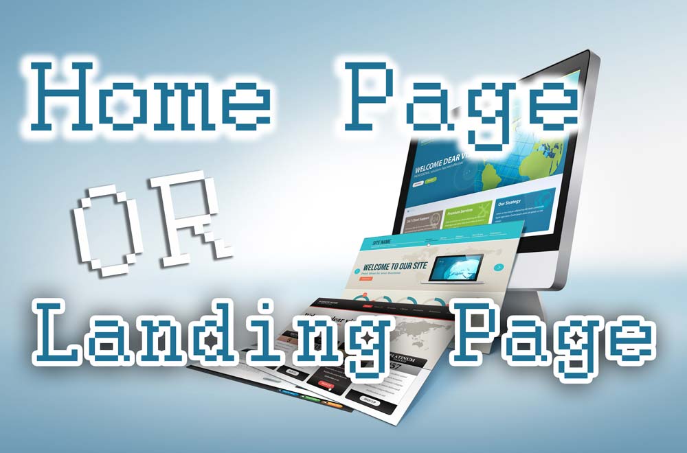
What is a Home Page?
The home page is the main page (or index page) of the website. It’s where visitors “land” when going to the root of your domain – this is probably why it’s mixed up with a landing page. In the case of my site, the home page is where you land when going straight to webeminence.com with nothing after the URL.
The purpose of the home page is a summary, an at-a-glance overview of your business. This could include brief explanations of services, contact and location information, pics of your team or store front, but in general, it is the visitor’s first impression and the main hub from which the rest of your site stems.
What is a Landing Page?
If a home page is “general,” a landing page is “specific.” Landing pages are often created for a single purpose, usually to advertise a specific product or service.
These are a single page, often without navigation, because you don’t want people to click away. You want them to stay on the page with plenty of calls to action to generate leads. And while landing pages will live on the same domain as a home page, they often don’t exist on the root domain and are instead a subdomain as you see in my video below on effective landing pages.
So, keep in mind that a landing page serves a specific purpose, often used in conjunction with an ad campaign, either online or offline such as a billboard or commercial. A home page should represent the totality of your business and services.
5 Elements of an Effective Home Page
Now you know the difference, but you still need to make them great. When it comes to home pages, combining these 5 key elements can make sure it’s eye-catching and effective.
1. Highlight the Logo
When I create a site, I like to really make sure that the logo stands out. Branding and recognizability is incredibly important. You’ll see a lot of sites that have a small logo lost in the header, but I often place it as a hero image, front and center, to give a good first impression of the brand. Don’t be afraid to highlight your logo and make it BIG and BOLD on the homepage.
2. Tagline or Slogan at the Top
A few words can go a long way in giving visitors an immediate sense of what you’re all about. The following is the tagline for one of my clients. Right in the middle of their home pages is 24/7 MOBILE ROAD SERVICE. And below that, MOBILE TRUCK & TRAILER REPAIR IN ATLANTA, MCDONOUGH, AND MACON, GA.
Now is there any question as to what they do and the areas they serve?
Any visitor to the site will immediately know if they’re in the right place. Bring that same clarity to your own site. It’s the first thing visitors read and should let them know who you are and what you do. Plus, it’s great for SEO, and can be your H1 heading for your homepage which gives you a better chance at ranking for your keywords.
3. Clear and Obvious Navigation
You need to make your home page as intuitive as possible when it comes to allowing visitors to navigate your website. At the top of your page there should be clear menus, allowing visitors to explore your site.
Remember to make sure that intuitive nature doesn’t disappear as soon as they scroll down. As they scroll there should be additional links for services or other pages. Lead them through your site, don’t make them guess. If you have a service menu at the top of your home page, consider having another at the very bottom.
4. Calls to Action
This is incredibly important as it’s what can convert a visitor into a paying customer. You don’t want them to have to leave your home page just to find a way to contact you. There should be phone numbers and contact information or buttons to request services or further information.
Maybe you want visitors to fill out a form in order to request consultations, appointments, or simply ask questions. If so, this form should exist on your home page. If they are interested, you definitely want to give them a clear way to get in contact right from the start.
5. Complete But Not Overkill
It may seem like I’ve given you quite a bit to put on your home page, but all of the things I’ve mentioned don’t necessarily have to take up much space. The last thing you want to do is over-stuff your home page with an overwhelming amount of information. Give them just enough to become interested and not be confused.
Trust that if your visitors want additional information on your services or company, they will navigate further into the site. Your home page should feature only the best, most streamlined information on your business. Don’t smash it all at the top. Clutter won’t win you any new leads.
9 Elements for an Effective Landing Page
As we discussed before, there are stark differences between landing and home pages, which means there are also differences in the elements that lead to their success. Landing pages are an amazing tool for successful digital advertising and incorporating these few elements and some helpful landing page tools can have a major impact on conversions.
1. Utilize Space Wisely
Don’t waste space or margins. Take advantage of all the real estate, but make sure you’re only using good information. You don’t want to clutter up the page with fluff.
2. Logo and Branding
Make sure you have strong branding. Use your logo (keep it big and bold here as well) to set your site apart. Don’t be generic. Make sure visitors remember you.
3. Calls to Action
Just like with the home page, calls to action are incredibly important here as well. In fact, when it comes to a landing page, they are even MORE important. I like to focus on phone numbers as these are one of the biggest actions that I track. So, consider adding a clickable phone number. And don’t be afraid to use the number (or call to action buttons) in more than one area. If you have it in the header also put it in the footer. If you have a contact form at the top, also have one at the bottom. The main goal of a landing page is to get those leads!
4. Great Images
Let people see what you’re offering. Don’t let these images be too small or a bunch of different sizes. And keep the file size small so they don’t create long load times on your landing page. Remember to only use the strongest images that truly showcase the best of your business. Also keep in mind, that the layout of images can change when viewing on mobile, so be sure to preview your mobile site as well.
5. Keep it Simple
You want your page to load quickly, and the best way to do this is to not over-stuff it. Keep the page short, which is even more important for mobile users as it cuts down on excessive scrolling. Streamline all your information and cut out anything you don’t need. Don’t repeat yourself… and stay focused!
6. Testimonials and Social Proof
Your work always shines best through the praise of happy, real-life users. Consider a few short and strong quotes. This isn’t the time to be humble. Let visitors hear why your business is the best!
7. Think Mobile
Judging by a few previous entries, you can see that considering how your site looks on mobile devices is vital. Most of my advertising clients get 50-80% of their traffic on mobile. You should consider designing a mobile page even if it’s a separate page or just a mobile version of the site. Some WordPress themes have a built-in visual builder where you can switch between desktop and mobile versions to insure the site looks great on both.
8. Use Video
Video gives you an easy, effective method to visually explain your site and, better yet, help your visitors connect with you as a business. There are plenty of tools out there to help put together strong videos, but I’d suggest checking out Animoto which walks you through building image-based videos through pre-made templates.
9. Pinpoint Location
You’d be surprised how many landing pages fail to mention their location. Location should be mentioned right at the top if possible. It might also be a good idea to place a map on the page. This might not be as important if you’re offering a virtual product, but it’s vital if you’re based at a physical location.