
CTA buttons are one aspect of web design that commonly gets overlooked.
Sure, there are numerous studies on the best CTA button color for success, microcopy, placement, and conversion-boosting tricks. Nonetheless, most businesses still rely on a dozen tried and tested phrases, making only minute adjustments (or none at all).
Is this truly the right way to go about CTA button copy and design practices? That depends on what your plans are. Are you after high clickthrough and conversion rates? If yes, the best thing you can do is learn when to follow or break the rules.
And the following are a few guidelines that will help you do just that.
User Expectations
To understand the best practices of designing CTA buttons, you must first understand the driving forces behind web user behavior. It’s quite simple, actually – people are creatures of habit.
Research from the past two decades shows that web users don’t read pages. Instead, they scan them for information. And they do this in certain patterns with a preference for the F-shape. Then there’s the fact that CTAs placed above the fold get a significantly higher amount of clicks, signaling that web visitors have well-established habits about the way they look at websites.
What does this mean for you? Simple: it’s a signal that CTA buttons are not the place to upset user expectations. If you want results, stick to these ground rules:
- Use uncomplicated, easy-to-read copy.
- Skip the experimentation with non-standard placement.
- Don’t play around (too much) with shapes and sizes.
- Stick with what works and make your improvements elsewhere.
For example, think about button shapes. Can you name ten websites that use circular, square, or triangle CTAs? We can’t either.
Nowadays, the standard is a rectangular shape, often made “friendlier” by rounding out its corners. It’s expected, looks good, requires less cognitive effort to understand, and seems to have a reassuring visual effect on web users. Plus, it’s almost everywhere – check out Twitter’s sign-up page, for example.
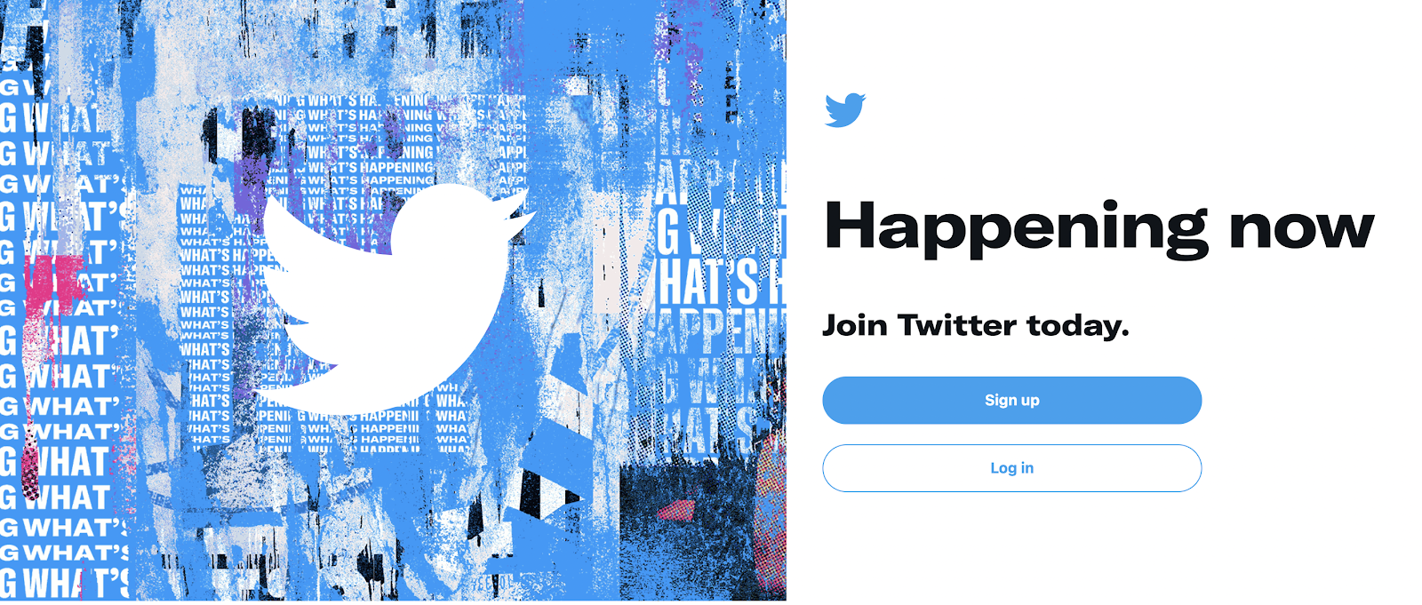
image source: twitter.com
Of course, if you insist on being different, make sure to back up your decisions with cold-hard data. Who knows, a unique CTA may work for you.
Color Choice
When it comes to CTA button design, color is often addressed as the most impactful choice you can make. Many studies have tried to pinpoint the best hue for calls to action. Famously, HubSpot found that red outperformed green by 21%.
But does that mean that CTAs all over need to be red? Not exactly. What’s much more important than coloring is a button’s ability to fit into your site’s and brand’s visual appearance.
From a design perspective, this necessitates two concrete considerations.
- Designers must work to make the choice that fits into the color scheme of a website. In this regard, a color wheel is an irreplaceable tool for identifying complementary hues that do not clash and provide sufficient visibility and contrast.
- A CTA button must follow the visual branding guidelines determined during the initial planning stages of your business. This doesn’t just mean color, but more importantly, the overall look of the CTA.
What’s also worth noting is that black or white often make the best options. These choices can offer just the right amount of contrast without overshadowing value propositions, plus, are guaranteed to look good. As an example, check out the Morphe homepage.
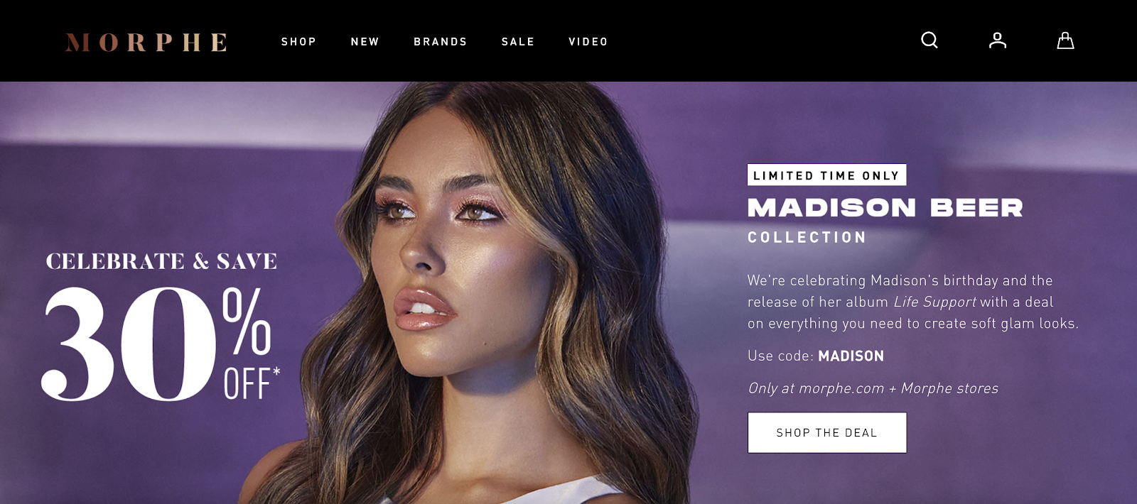
image source: morphe.com
White Space
One of the main principles of design, whether you’re working for digital or traditional publication, is that high-value details, that is, the subject of a page/piece of art, must be surrounded by sufficient negative space.
The idea is simple. By leaving plenty of blank space around these elements, viewers (or, in this case, web visitors) will instantly focus on what matters the most. If your objective is to secure conversions, then, naturally, CTA buttons are the elements that need to stand out.
There are tons of excellent examples of how negative space can draw attention to calls to action and even secure high clickthrough rates. Take a look at the Google Store. There, products are presented on clean backgrounds, with minimal copy and a simple CTA button.

image source: store.google.com
Of course, it is worth noting that white space does not necessarily have to be white. Any color scheme or a background image that allows proper visibility can serve your brand. Just take a look at Odd Pears’ website, which has a prominent hero section image. It’s colorful, yes. But it’s also functional and in line with the brand’s eclectic identity and provides an excellent background for the “Shop Now” CTA button.
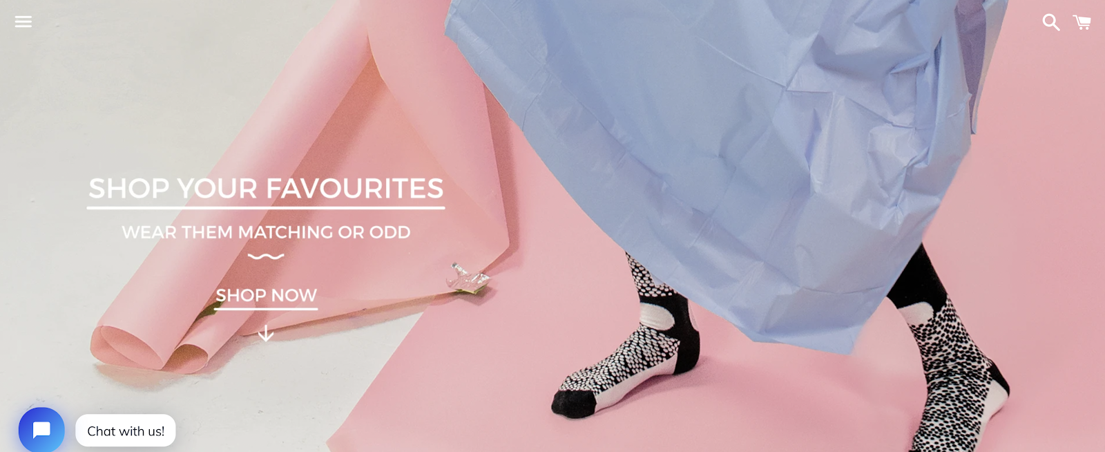
image source: oddpears.com
Copy
When it comes to making your CTA buttons sufficiently compelling, you mustn’t consider just visual appearance. Keep the language in mind as well. Seeing how these elements tend to be small, there are a few ground rules to stick to:
- Use four words or less.
- Choose the active voice.
- Use 1st person speech.
- Pick a large and legible font.
- Use powerful words that drive action or urgency.
- Present your value proposition.
The safest way to go about CTA button copy is to stick to standard practice, with the occasional twist. If you don’t have anything groundbreakingly new to contribute, don’t experiment.
However, if you are offering something valuable to your customers (like a discount or a free item), then definitely make this a part of your CTA copy. See the example from EA’s Apex Legends below.
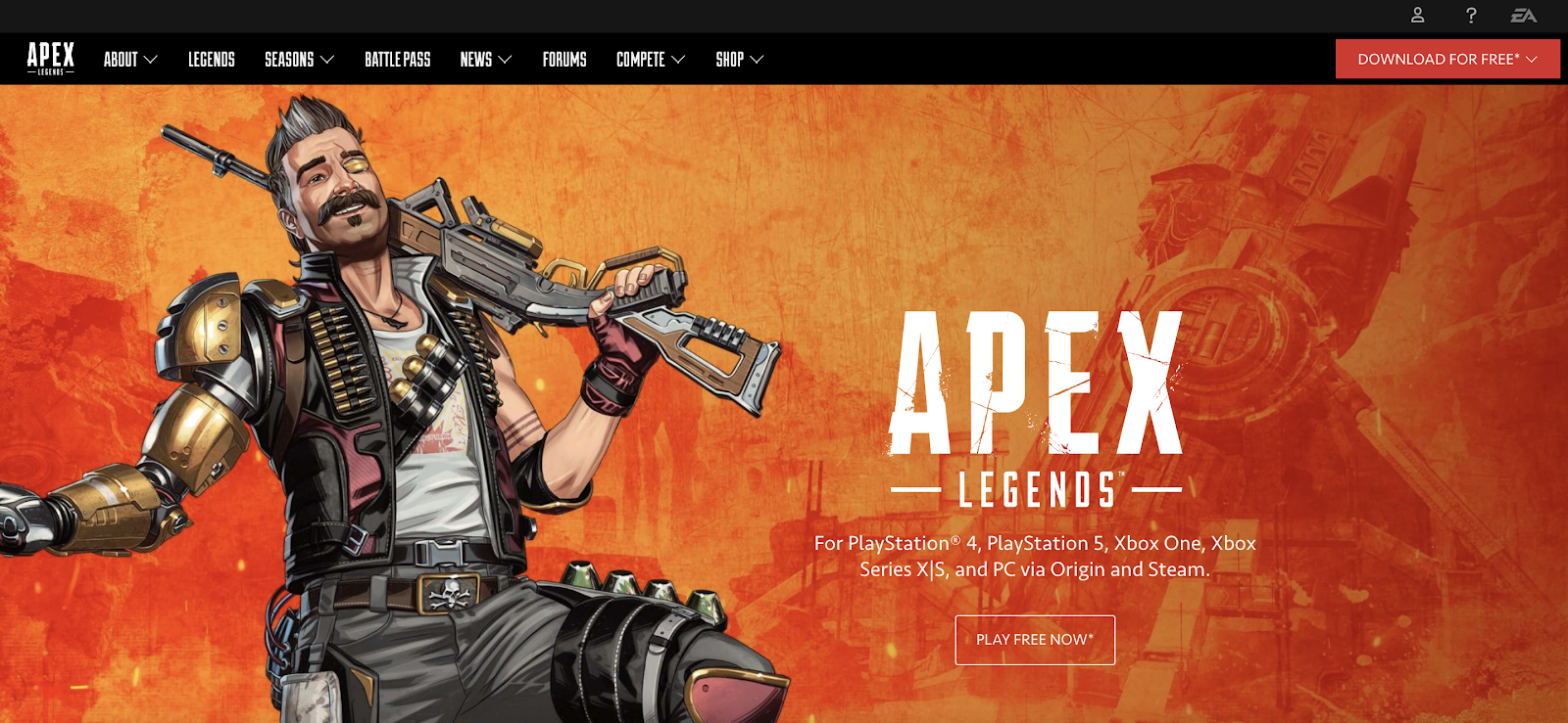
image source: ea.com
Putting Customer Needs First
Finally, we’re getting to the aspects of CTA buttons that often get forgotten about.
For one, designers must remember that there is a real need for variation in CTA buttons, seeing how not all website visitors are in the same stage of the buyer journey. Sure, someone at the bottom of the sales funnel might react to a “Buy Now” CTA. But the same can hardly be said for people who are still in the awareness stage.
Slack does a great job at solving this issue with several different CTA buttons peppered throughout its landing pages. For example, the features page shows three distinct buttons: one for those ready to download the app, one that offers more information, and one that gets potential clients in touch with a customer service rep.
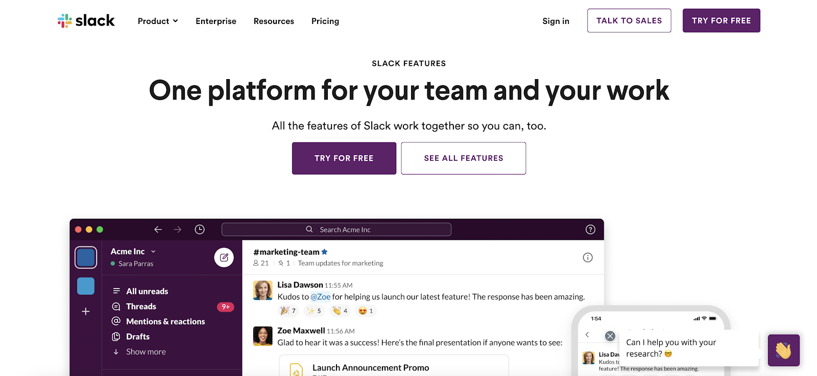
image source: slack.com
The second thing about CTA buttons you must remember is that they represent a limited space to convey (sometimes) complicated ideas. Naturally, this means that web visitors may have some objections when met with limited info such as “Start Free Trial.”
Fortunately, microcopy can be of great help, providing additional information where it’s needed.
Take a look at InFlow’s purchase order management software page. It adds a note below the CTA button, stating what it is exactly that the app’s free trial consists of. This way, potential customers know what to expect and will not be walking away with unmet expectations at the end of the sign-up process.

image source: inflowinventory.com
Final Thoughts
As you can see, there’s plenty of work to do for anyone looking to design compelling, proven-to-work CTA buttons. Fortunately, it’s a relatively straightforward process that relies on well-established rules.
Does that mean that all calls to action are the same? Definitely not!
Each brand will have unique needs based on its goals, target audience, and visual identity. That’s why one of the ground rules of CTA design is that it requires continuous testing. Because, in the end, the only way to make the right decision is to check whether it actually works for your site.