
Smart web designers know how to use iconography to optimize their product pages. Replacing words with icons creates space for other important elements that aid in conversion. It also significantly decreases the amount of time needed to communicate ideas to their audience. Which could maximize return on ad spend or other marketing initiatives.
At the same time, combining text with iconography is a great way to draw attention to important points about the product.
In this article, we’ll discuss iconography specifically in the context of a product page, taking a look at how you can use icons to improve visitors’ experience on your ecommerce site.
1. Draw Attention to Your Product’s Unique Selling Points
Icons are a great way to underscore the qualities of your product that make it stand out from your competitors. A simple, well-designed image acts as a beacon for a visitor’s eyes, simultaneously drawing them to a message and helping communicate it.
When using an icon in this way, it’s often a good idea to have text accompanying the icon. Unique selling points can be slightly more complex than a “play” or “pause” button and will need some additional messaging to drive the point home.
For a good example of an ecommerce product page using icons to communicate a product’s USPs, take a look at Herbal Dynamics Beauty’s Vitamin K cream page. Right below the product description, the site designers have included four icons communicating four of the product’s major selling points, each relating to the brand’s identity as a purveyor of “natural” products.
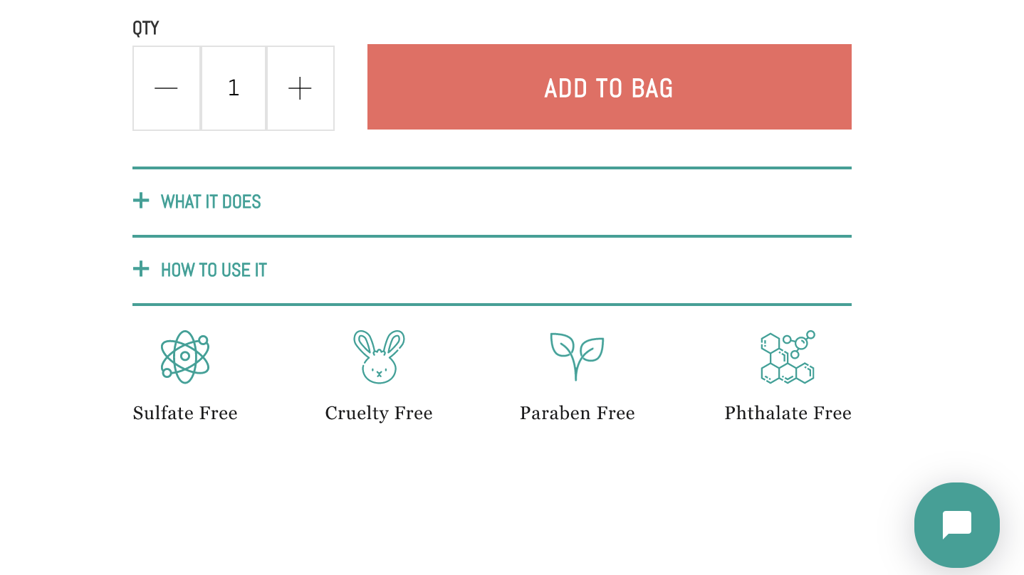
image: herbaldyanmicsbeauty.com
As your eyes scan this product page, try to imagine these four USPs being communicated without the icons. What are the chances that your eyes would have picked up the words “Sulfate free,” “Cruelty free,” “Paraben free,” and “Phthalate free” without these images?
Sure, you may eventually have noticed these messages if you read every word on the page. While placing them beneath meaningful, eye-catching visuals makes them much more noticeable.
2. Communicate Value Adds Visually
Online shoppers have some very common concerns and issues when they’re dealing with a new store. As a shopper browses your goods, you want these concerns as far away from their minds as possible.
That’s why many stores make it VERY obvious that they offer value-added services like free shipping, money-back guarantees, and a secure transactional environment.
To make 100% certain that these messages hit home, some online stores choose to use icons to draw attention to them. Again, combining these icons with text is a good move; even though their meanings have become obvious, it’s not possible to communicate certain nuances with an image alone.
For instance, a moving truck or airplane is typically used to communicate “Free shipping.” However, if this is contingent on a specific order size, it’s probably a good idea to include this in the text.
The same goes for guarantees. For example, your store may only extend one for goods that were returned within 30 days. Again, that’s an important thing to communicate with text.
For an example of a product page that does this to great effect, look no further than online watch retailer MVMT.
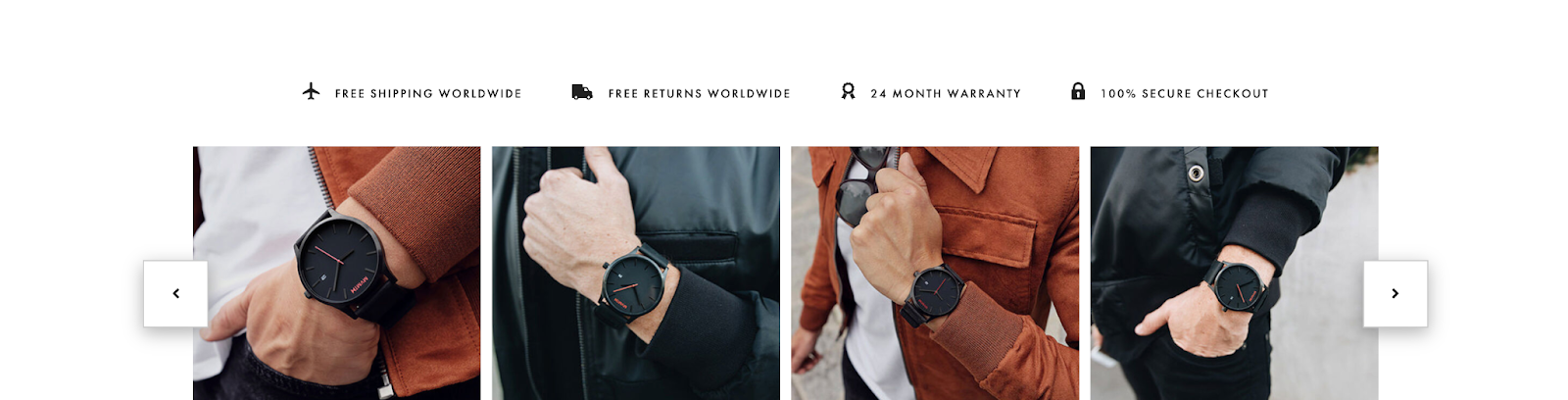
image: mvmt.com
3. Lose the Words for Common Ecommerce Links
There are certain links on an ecommerce product page that have become so ubiquitous that there’s no need to involve text at all. In these cases, you’ll be saving space, reducing visual clutter, and reducing the amount of information “processing” your visitor’s brain has to do.
Online fashion retailer, Allbirds, shows us several great examples of how to use icons in the place of text links:

image: allbirds.com
An image of a shopping cart is used for the link to the customer’s shopping cart. A number value overlays this icon, showing the number of items it contains.
The site uses a question mark inside a circle as the link to their Help page. There’s no need to bring words into this. People have become very accustomed to this icon and its meaning.
A blank “avatar” icon is used as a link to the customer’s profile page and a generic chat window image is used to trigger the live online support feature.
Another smart way that Allbirds avoids using redundant text is in the reviews link. Most web users have become used to star-rating indicators being associated with reviews. That’s a fact that the site smartly exploits to save space in a key area of their product page.
By simply underlining the “number of reviews” indicator, Allbirds instantly turns this element into a clickable icon that navigates users to the product page’s review section.
Some Iconography Design Tips
If you’re planning on using icons on your ecommerce site’s product page, here are some important things to bear in mind.
Many sites opt to buy a predesigned icon pack from design websites. It’s an affordable alternative to involving a graphic designer. If this is the route you choose, be sure to select a pack that’s aligned with your site’s color scheme and overall aesthetic. Don’t pick an icon pack based on how it looks in isolation.
Furthermore, don’t overuse icons. A page littered with imagery will desensitize your visitor to their significance. Your aim is to grab the user’s attention, so that would be the exact opposite effect you’re looking for.
If some of the icons on your page are used as links, make sure they’re visually differentiated from icons that aren’t linked. If a user notices that icons with a particular style can be clicked, they’d expect the same outcome from all icons with a similar style. Respect their experience on your site.
In Closing
Icons are an excellent visual communication mechanism. They convey a message clearly and effectively and also offer a super-effective means to draw users’ attention to important sections of text.
Thanks to the popularity of “stock art” websites that specialize in iconography, integrating icons into your site is simple and very affordable.
Choose them wisely, use them sparingly, keep them consistent, and icons are sure to enhance shoppers’ experience on your site’s product pages.