How do most lawn care professionals create websites?
Most lawn care businesses are small and don’t have large budgets for website development. So many business owners turn to website builders and local web designers to get their website online. Regardless of the method you choose to get your website created, there are some critical aspects for any lawn care service to consider when making their mark on the internet.
I’ve taken a look at several websites from lawn care service professionals and found these common problems. Don’t repeat them on your website!
- not mobile friendly – Many lawn care service websites don’t have the technology to be mobile responsive. As a result, an increasing number of customers can not see the website on their tablets and smart phones…bad news.
- poor design – Search for yourself and you’ll find 9 out of 10 lawn care service websites are outdated in their design.
- not updated – Another downfall of small businesses with small budgets and small staffs – they just don’t have time to update their website so it’s content is usually a few years old.
- pictures not optimized – It’s a tell-tale sign of an amateur website – pictures that are not optimized for the web. If you’re building your own website, here’s some instruction on optimizing images so you have no excuse.

What are the most important aspects of lawn care service websites?
I asked several hundred lawn care professionals in a few Google Plus and LinkedIn communities this question. Here’s what they had to say:
- pictures – Let’s face it – Landscaping and lawn care is a visual business. You gotta have outstanding pictures of freshly cut grass and impressive landscaping. Sharon Harding, a Remax Realtor in the Chicago suburbs, made the suggestion of a picture of the entire staff in uniform standing in front of the company office. This is a great way to communicate trust…my next point.
- communicating trust – Customers of lawn care services are inviting someone onto their property on a weekly basis so they must trust the company and individuals they are hiring. A lawn care business website should be personal and give information on the company in order to build trust.
- clear services – Since landscaping and lawn care is ultimately a service, clearly listed services are a must. I’ve seen landscaping websites with NO services listed or hundreds of services listed. Both extremes are not ideal. Clearly list and explain your major services so website visitors can see what you do, but not be too overwhelmed.
- payments – Not many of the landscaping websites I researched had payment systems that allowed customers to make automatic payments online. People are accustomed to convenient payments and providing that service can be a feature that sets you apart from your competition.
- local targeting – Lawn care businesses are local businesses. It has to be obvious where the business is located and what geographical area is being served.
My Client’s Website
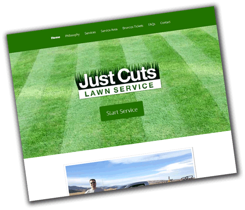
 The website I created recently for a lawn service professional is not your typical landscaping website. (You can find a link in the first sentence of this post.)
I use professional WordPress themes from Elegant Themes and was able to give this website a very unique and modern look compared to other lawn care service websites you typically see online. You’ll notice that there is not a lot of clutter on the home page, just a picture of grass and the logo. Everything a customer needs can be easily found through the simple navigation, but it’s not all crammed onto the top of the home page the way many websites do it.
Another unique aspect of this site is the payment system. We created a secure form using Jotform.com to allow secure credit card information to be submitted through the website. The business owner then processes the cards manually using his merchant account.
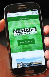
Oh yeah, make sure to check out the website on your phone too and you’ll notice it’s mobile responsive.
If you would like some advice on building a website for your lawn care service business, get in touch with me and let’s see how I can help
Calling All Lawn Care Professionals – What Do You Think?
Building one landscaping website and doing one day of research does not make me an expert in the lawn care industry. So I’d love to hear your input. If you’re a lawn care professional, what do you think I missed in my lists above? What are some important things to include in a landscaping website and what are common mistakes?
If you’re not a landscaping professional, I’m impressed that you read to the bottom of this post. 🙂 But what do you think are the most important aspects of a lawn care professional’s website?
Comment below and let’s discuss…
