My personal feeling about a carousel is somewhere in the middle – either use them correctly or don’t use them at all.
The fact is, carousels and sliders can be an extremely smart way to showcase a range of products without taking up too much of your store’s valuable real estate. But before you decide to implement one on your ecommerce site, you’ll want to familiarize yourself with what works and what doesn’t.
In this post, we’ll take a look at four examples of web designers getting product sliders and image carousels right.
1. Au Lit Fine Linens
The Canadian linen retailer’s website makes use of an elegant link carousel to give their users an additional entry point to certain pages on their website.
Rather than showcase specific products or web pages with a similar content designation (like product categories), Au Lit uses this element as a link “sandbox.” This gives the site owners flexibility to direct traffic at pretty much any area on their website which they feel needs a boost in traffic.

image source: aulitfinelinens.com
This element gets a lot of things right. The design of each frame is extremely attractive; there’s also a common layout theme running through them all, but each one is still easy to differentiate from the other.
Because of the amount of space allocated to each frame, the designer had enough room to include meaningful, engaging copy along with a very clear call to action in the form of a button. Each button has a label specific to the frame’s destination page.
Navigating from one frame to the next is entirely manual and triggered by two highly visible but unobtrusive arrow elements placed on the far left and right of the carousel. A secondary navigation option is also available in the form of clickable dots at the bottom of the element.
2. Orizaba Original Baja Hoodies
One of Orizaba Original’s biggest selling points is its large selection of products. The site owner wisely feels that this should be something that visitors should be made aware of very early in their shopping journey.
And what better way to do this than with a product slider?
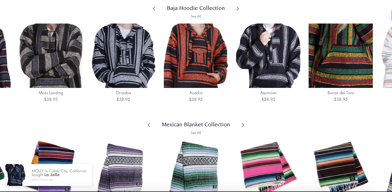
image source: orizabaoriginal.com
The site avoids some of the biggest pitfalls typically associated with this UX element with some very clever design decisions.
Firstly, the slider is placed below the fold. This means that it’s not the very first thing a visitor sees when they arrive at the site. The area above the fold is too important to use for an element that can be a little busy or even cluttered.
Each product’s image switches to a different view when the user hovers the mouse pointer over it. This is a terrific way of maximizing the modest amount of real estate allocated to each item.
The designer also opted to limit the amount of information displayed along with each product, showing only the name and price underneath each product image.
Only the user can navigate to a new row of products. There’s no automatic movement that can distract the user or cause them to click on the incorrect product.
3. Zappos
Zappos does something very similar to Orizaba Originals on their homepage product slider.
The popular online shoe retailer has included some social proof in their product slider, displaying the number of times shoppers “favorited” each shoe.

image source: zappos.com
Other than that, the product slider conforms to most of what’s become best design practice. There’s no automatic scrolling. The product images are all very uniform in design and show the products on a clean, uncluttered background.
In addition, the number of rows has been limited to three; there’s very little chance of the visitor being overwhelmed by the amount of product options and links on display.
4. Newegg
Newegg has one of my favorite image carousels. It’s one of the few I’ve encountered that works very well despite each frame containing quite a bit of visual information.

Somehow, through excellent design choices, Newegg manages to use the carousel as their primary home page header without hurting the user’s experience on the site.
We have to point out that Newegg clearly employs some very gifted designers. Each frame is exceptionally well laid out, the font choices are varied and visually stunning, the background and primary images are eye-catching and extremely engaging, and the calls to action are never lost amidst all these visual components and messages.
In the hands of less-skilled graphic artists, this image carousel could have been a UX disaster.
Despite Newegg’s decision to automate the frame transitions, their inclusion of two clever “pause” features negates any potential UX problems a user may have faced.
Firstly, the user has the option to stop automatic frame switching by clicking a pause icon in the bottom-right corner of the carousel. Secondly, when the user’s mouse hovers over the element, it won’t transition to the next frame.
Some Final Thoughts on Using These Elements
In closing, allow me to play devil’s advocate for a minute.
Not all ecommerce sites need product sliders or imager carousels. Despite numerous examples of them being used to great effect, there are some good reasons why they should be avoided.
Admittedly, all these reasons can be mitigated with some good design choices. So, to summarize:
1. Too much movement on your web page will distract your visitors from other, potentially important, visual elements. This can be avoided by ensuring that the carousel or slider only switches frames when the user specifically chooses that.
2. Having too many messages in one space can compromise clarity. Users may be overwhelmed by the amount of content squeezed into one area, so they won’t pay enough attention to an important frame. This can be solved by increasing the size of the carousel and limiting its number of frames.
3. Missclicks will seriously annoy your site’s users. This happens when a visitor wants to click on one frame, but the carousel’s automatic shift to another sends them somewhere else. Avoid this by never automating slide-switching.
Carousels and sliders are fantastic UI elements if used correctly. But, as an ecommerce retailer, it’s vital that you understand the risk involved in haphazardly implementing one.