Photo by Edho Pratama on Unsplash
One of the reasons that might lead to a high bounce rate is the poor design of your site. As a result, the experience of users on it is not justified, and they leave without even getting to know more about your enterprise. The best-case scenario is ordering the development of your website from a professional and reputable agency like appkong.com that will provide you with a site with an interface improving the user experience.
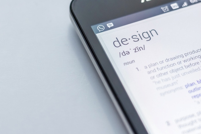
A Few Words About UX
In its essence, UX revolves around making the experience of your site visitors as valuable and meaningful as possible. A good user interface ensures that:
- Users have visited your site;
- They have clicked through different pages;
- They have had a clear view of your website and your company;
- They have got what they were searching for.
There are several factors that directly influence the UX. They can either make or break your business. They are:
- Value: Does your product, service, or content satisfy users? Do they justify the time visitors spend on your platform?
- Usability. Is it easy to use a site?
- Impact. Does your brand’s site evoke the emotions of users?
- Convenience. Is it easy to navigate on your platform?
- Availability. Can people with disabilities easily access your website?
- Confidence. Does your site, its content, your service, or your brand convince users to become your clients?
How to Improve Your Website User Experience: Useful Tips
Having replied to the above questions, you might have already understood what your platform lacks to improve the UX. However, keep reading to know more about improving the experience of users on your website:
Recommendation #01: Use available spaces appropriately
White space is essential for the great design of a website. When it is used properly, it makes the content of your site more legible. Meanwhile, with its help, users can focus on the necessary elements — the elements you want them to notice.
Some research shows that white space around headings and text can increase the attention of users by around 20%. With its help, your site will look fresh, open, and contemporary. If white space is properly aligned with your branding, it can help you convey your message to users more clearly.
Recommendation #02: Ensure the optimization of your page speed
If your site loads for a long time, users will become annoyed and leave. It’s crucial to remember that people are not patient enough to wait for a site to load. The competition has made platforms compete for every second of loading of a site. If it takes more than three seconds, a user is highly likely to close the site.
When users cannot immediately find what they are searching for, they may leave your site forever. One study found that users expect a website to load in less than 2 seconds.
Compress the videos and images before uploading them to your site — this is a great step to start if you want to increase the loading speed of pages of your website. Looking for a way to add visual content of the highest quality, it is always essential to remember the impact of their sizes on the loading speed.
Recommendation #03: Use compelling CTAs
We can surely say that most of your site visitors are already well aware of how to follow visual cues that point them to important content. A CTA tagged with the action word makes it easier for them to navigate your site. While for you, it is a convenient way to offer the users your products or services.
When creating CTAs for your site, consider the psychology of colour — different colours evoke different emotions. Think about the emotions you want to evoke and choose the colour scheme accordingly.
Another critical factor to consider is the words you use for your call-to-action buttons. Generally, you should select words that include an action word that clearly tells your visitors what they will get by pressing it. Make sure words are action-oriented and time-sensitive.
Recommendation #04: Use well-written headers
Your headlines and content should provide your potential visitors with what they are looking for. Including keywords in your headlines is critical if you want to reach the right audience. It is also essential for SEO of your website since search engines give more weight to titles and headers than to other content, so design your heading to improve your rankings. Additionally, the right content will resonate with your audience and speak to them effectively. You should consider setting up a consultation with a UI design company to learn more about their services and how you can benefit from this.
Recommendation #05: Keep everything consistent
In other words, check all colours, font, spacing, styles, sizes, buttons, spaces, pictures, etc. They need to be designed in style and manner, as well as be consistent on all the pages of the site. Also, refrain from making radical design changes so that visitors don’t get confused and wonder if they’re on the same site.
Tip #06: Remember your 404 errors
While search engines won’t penalize your site for 404 errors (page not found), most visitors will. When users click on an image or link, they expect the link to redirect them where they want. Remember that a 404 error is annoying to your visitors and makes them rethink the time they will be spending on your site. You do not want your site to be remembered for errors users see after clicking on links.
Check if there are 404 errors by setting up Google Webmaster Tools and allowing it to check for crawl errors. You can also use free online 404 checkers to easily spot them.
Final Words
Finally, keep in mind that you interact with various websites all the time, and you get annoyed by certain things. Write them down and make sure your site does not have the same mistakes or inconveniences to users. You need to develop a platform for people, not search engines. Always remember this.