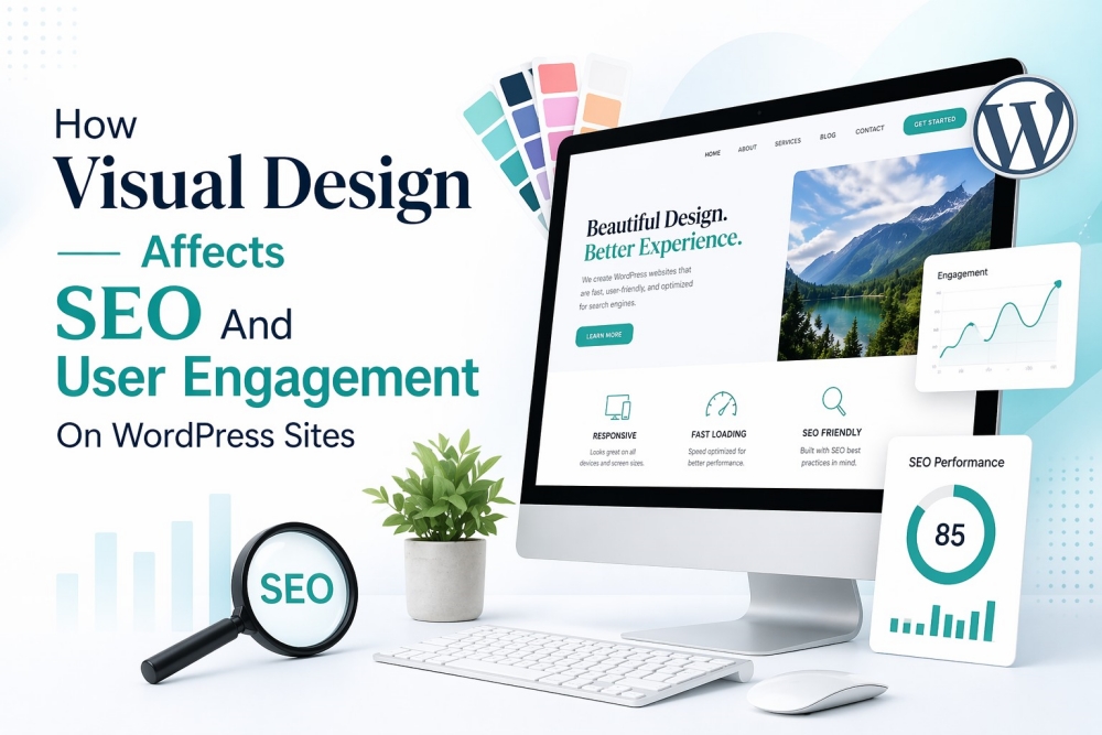
A visitor lands on a WordPress page and decides within about 50 milliseconds whether they like it or not, according to Google research. That’s faster than a blink. So before your carefully crafted headline even has a chance, design has already spoken. Let’s unpack how that silent conversation shapes rankings, engagement, and whether anyone stays long enough to care.
The first impression equation: design meets behavior metrics
Search engines don’t see your design the way humans do, but they absolutely see what your design does to users. Metrics like bounce rate, dwell time, and pages per session are shaped heavily by visual clarity. A cluttered layout makes people leave. Slow-loading visuals do the same. Adobe found that 38% of users stop engaging with a site if the layout is unattractive. Not broken. Not slow. Just unattractive.
Why this matters for SEO
- High bounce rates can signal low relevance
- Low dwell time suggests weak content engagement
Come to think of it, design is less about decoration and more about reducing friction. The easier it feels, the longer users stay, and that’s exactly what search engines want.
Visual hierarchy: guiding the eye and the algorithm
White space breathes life into text blocks. A reader spots headings fast when size leads the eye. Darker tones pull focus before lighter ones do. Fonts carry the mood without saying a word. Line gaps decide how easily words flow. Order emerges through small differences. Placement shapes understanding step by step. When done right, users follow a natural path through the content. When done wrong, everything competes at once. Even small visual elements like clipart can influence this flow if used carefully, especially when they follow a consistent visual style. They can guide attention or, if overused, disrupt the experience entirely.
The SEO connection
Google increasingly relies on natural language processing to understand content structure. Clean visual hierarchy often aligns with clean HTML structure, better accessibility, and clearer content meaning. So while Google doesn’t see your fonts, it benefits from the clarity they create.
Page speed and visual weight: the invisible trade-off
Here’s where things get tricky. Rich visuals improve engagement but can slow your site down. Speed is not optional. Speed matters most when pages take too long to respond. Think of how slow loading feels after clicking a link. Images that weigh down the page tend to drag performance lower. Animations often add bulk without helping users move faster. Even small graphics nobody needs pile up behind the scenes. Google tracks things like first meaningful paint and responsiveness moments. Those metrics shape where sites appear in results. Delaying response by just a second might cost seven out of every hundred visitors. Simplicity sneaks in quietly as the better choice once clutter fades.
Color psychology and emotional engagement
Color is not decoration. It’s persuasion. Different colors trigger different responses. It’s quiet, yet strong. Blue earns confidence, while red pushes a sense of now, whereas green either quiets the mind or moves you forward – context decides. A study at Loyola University found that hues can lift how easily a name is remembered by as much as 80 percent. How color shapes behavior
- Strong contrast improves readability
- Consistent palettes increase trust
- Accent colors guide attention to actions
Even small inconsistencies matter. Mismatched clipart colors, for example, can disrupt visual harmony and create a sense of unease that users may not even consciously notice.
Mobile design: where engagement lives or dies
Over half of internet visits now happen on phones, data shows. Sites built without small screens in mind slowly fade from view. Fast loading matters. So does a clear layout. Touch targets too small cause annoyance fast. People leave when reading feels like work. Smooth scrolling helps keep attention. Tiny text pushes visitors away. Pages that adapt stay relevant. Visual elements must scale properly. Clipart that looks fine on a desktop can become awkward or distracting on mobile if not adapted. Let’s put it simply. If a user struggles to navigate, they won’t stay.
Trust signals hidden in design
Trust is often visual before it is verbal. Clean layouts feel more credible. Consistent design suggests professionalism. High-quality visuals imply authority. Stanford research shows that 75% of users judge a company’s credibility based on design alone. And interestingly, the most effective trust signals are often invisible. Alignment, spacing, visual balance. Nothing flashy. Just quietly competent design.
Conclusion
Visual design is not an extra layer added after SEO. It is part of how SEO works. Every spacing decision, color choice, and visual element shapes user behavior. And those behaviors influence rankings more than many realize. The real trick is not making the design noticeable. It is making it effortless. When users don’t think about the interface, when everything feels natural, that’s when design is doing its job. And that, oddly enough, is when SEO benefits the most.