
And nothing matters if people don’t convert once on your website.
Website owners often forget that the website they design is not for them, but for their site visitors.
Because of this, website owners also fail to recognize the design principles they should be following when they launch their small business websites.
That’s why today we’re going to take a look at some of the most common web design strategies to help you drive traffic to your site, engage people with your content, and generate more sales.
1. Learn From the Best
If you’re launching a new business, and have no idea how to design your website to convert, you should take a look at what others before you have done with their sites.
After all, every successful website has done something right, or else they wouldn’t be considered a success.
If you want an easy way to keep up with what the competition is doing with their landing pages, social media messages, and even blog content, start by subscribing to their email lists.
Then, sign up for a free Unroll.me account. This free service will “roll” all your subscriptions into one email each day and send them to you so you can see exactly what everyone you’re spying on is doing!
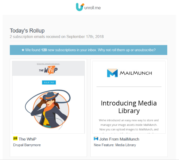
This is helpful if you want to know the following:
- What kind of images are being used?
- What type of calls to action are being used and where are they placed?
- How is blog content is structured? How often do they post?
- Which keywords are being targeted?
- What kind of headlines and value propositions are being used in blog posts and on landing pages?
- How much user engagement is happening in the comment section and across social media?
If you happen to operate a Shopify store or an e-commerce site, you can check out some of the most successful Shopify shops across the internet to see what they’re doing in terms of web design. If you’re not familiar with Shopify, checkout my review here.
For example, see what kind of products they’re selling, how they personalize their sites, what promotions they run and how they’re displayed, and what type of ads they run.
You can always read about the latest web design trends and try to implement them into your own website’s look.
But if you want to know what’s really working in the real world, you should look at real-life websites and get your inspiration from them.
2. Use Web Safe Fonts
A long time ago (okay, not that long ago), but back in 2014, the term “web-safe fonts” was coined. Web-safe fonts are fonts supported by all major internet browsers and are typically those that are installed on users’ word processing software.
Any other fonts used on a website that are not considered web-safe could end up displaying as random symbols when a site visitor lands on a website.
As you can imagine, this isn’t good for the user experience or business.
Although browsers have advanced over time, and can now accommodate font styles that are not considered web-safe, it’s still better to be safe than sorry and use browser compatible fonts.
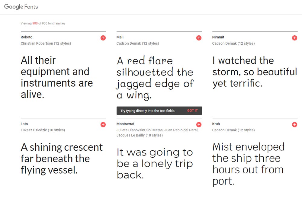
Luckily, the number of web-safe fonts has exploded, giving websites owners creative flexibility over the look of their sites. The best place to find free web-safe fonts is in Google Fonts.
These open source font styles are proven to look great on websites and render seamlessly for site visitors regardless of what browser they use.
In addition to using the right font style, here are some web font best practices:
- Use serif fonts for headlines because when they are smaller in size, they’re harder to read
- Stick to sans-serif fonts for body content as they are easy to read, even at small sizes
- Pick a few font styles to use on your website and stay consistent; too many styles can be distracting and visually unappealing
- Leave plenty of whitespace, so users don’t feel overwhelmed with text (remember, most people tend to scan content anyways)
Your site visitors are going to read what you have written on your website. That’s why it’s best to use smart design principles when it comes to font choice if you want people to stick around.
3. Be Mindful of Imagery
People are visual by nature. In fact, take a look at these statistics:
- People can identify images they have seen for as little as 13 milliseconds, which helps with brand recognition
- Approximately 65% of people are visual learners, which is lucky for us web designers!
- Presentations with visual aids are 43% more persuasive than unaided presentations
When it comes to the images you use on your website, it’s best to use bold imagery that relates to your content.
Pictures are meant to complement your site’s content, not overwhelm it and disengage site visitors.
Lastly, images are supposed to help you convert customers.
Whether they be product images, demo images, or imagery to convince someone to subscribe to your email list, all images should have a clear purpose before being uploaded onto your website.
If you’re interested in creating your own images, check out the free tool Canva.
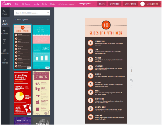
With plenty of pre-designed templates to choose from, you can create infographics, banners, logos, and much more. From there, you can change color schemes, fonts, text, and even upload your own images to create a one-of-a-kind visual for your website that site visitors will love.
Also make sure to check out my video review on Venngage for creating infographics and lots of other visual elements.
4. Optimize for Mobile
If you plan to drive as much traffic to your website as possible, it’s essential you don’t leave out your mobile users. After all, 51.2% of all global internet traffic is mobile.
There are two ways to cater to those accessing your website on smaller devices such as laptops, tablets, and smartphones:
- Create a dedicated mobile site explicitly optimized for mobile users
- Build a responsive website that works for all site visitors no matter what device they use (recommended)
Either way, it’s crucial you make your site mobile-friendly so calls to action button can be clicked, text can be read, and there is no excessive scrolling, zooming, or device flipping.
Take a look at these quick tips for making your site mobile-friendly, SEO optimized, and highly converting:
- Learn how people use your website while on mobile devices with a free online tool like Google Analytics. Read my post here on how to setup Google Analytics.
- Limit navigational menus and the number of items
- Optimize images for fast loading speeds
- Include autofill functionality on all forms
- Make CTA buttons large and easy to click
- Keep the design minimal with lots of whitespace
If you want to make sure your website is responsive, use Google’s Mobile-Friendly Test by entering your site’s URL.
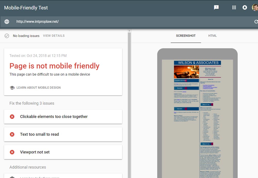
If your site isn’t rendering for those on mobile devices, Google will suggest ways to improve so that it can.
Final Thoughts
In the end, it takes more than a beautiful looking website to get site visitors to your site and taking action.
And it takes more than great products and services to secure long-term, repeat customers.
However, if you follow the basic web design principles that help drive traffic, engage site visitors, and convert people into subscribers or customers, you’ll find success sooner than later.